Brushbox
The first oral health subscription service in the UK
Brand

- Discovery Workshops
- Brand Strategy
- Brand Positioning
- Brand Identity Design
- Packaging Design
- Brand Guidelines
- Brand Collateral
- Brand Training
Digital

- Website Audit
- Discovery Workshops
- UI Design
Brushbox is the first oral health subscription service in the UK. Their affordable, convenient, quality, and fun oral care products are sent straight to the subscribers door so you don’t even have to think about buying new every 2-3 months (like the dentist recommends!).
No doubt that when watching tv or a film from around the globe, you will have been confronted with a joke about the perception of the UK’s dental hygiene, or lack of as the case may be. The UK has become infamous for its poor oral health practices and Having noticed this distinct issue, Mike Donovan, an Associate Director at Deloitte, had a vision to set up the UK’s first oral health subscription box service that would provide affordable, convenient and quality designed oral care products straight to the subscribers door.
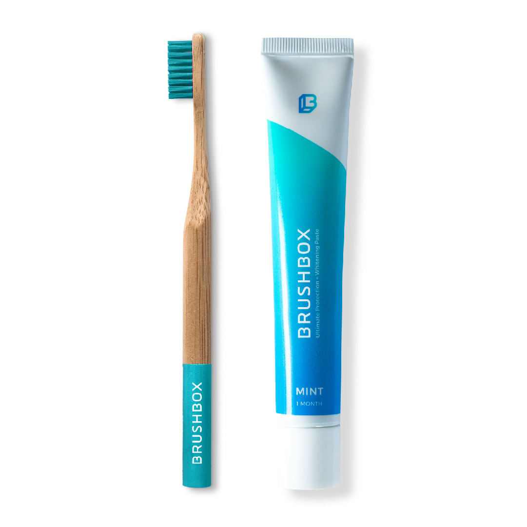
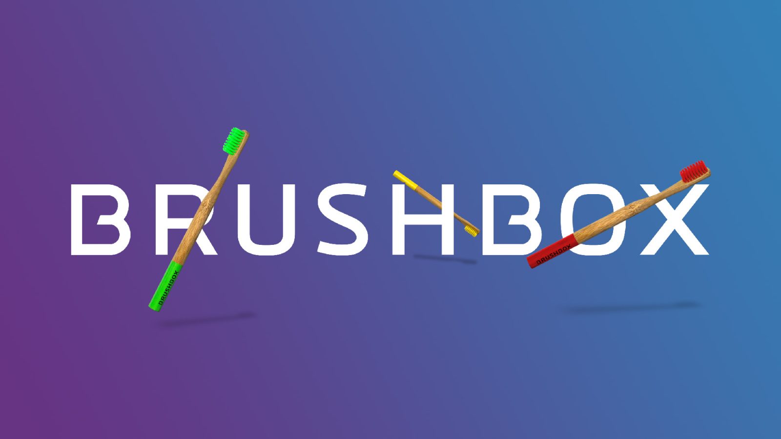
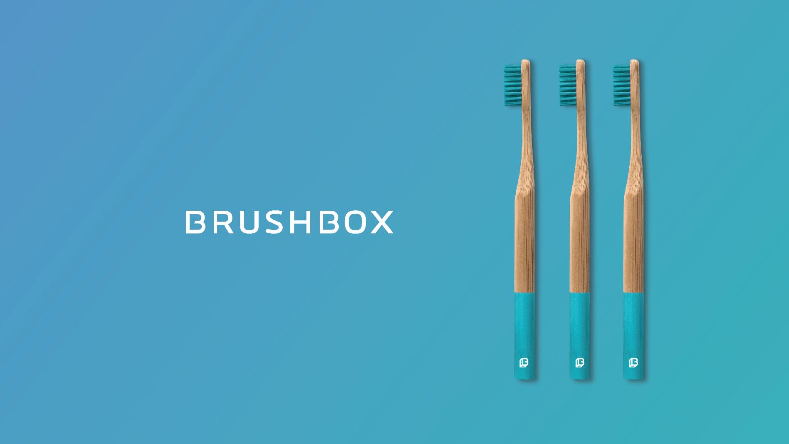
The Brushbox logo features a customized sans serif typeface, simplifying the letterforms and turning the B into an iconic symbol that can be used on its own as the brand becomes more established. A lot of the brand aesthetic comes from a clever use of colour and clean textures; taking inspiration from beauty brands and popular influencer social media photography, the brand’s accompanying imagery is fresh, uncluttered, contemporary, stylish and most importantly, aspirational. This brand succeeds in turning an unsexy topic (i.e. brushing your teeth!) into something desirable, fun and attainable.
One primary and four secondary colour palettes were designed to give Brushbox a wealth of bright backdrops to choose from whilst keeping the overall feel cohesive. Subtle gradients were also added to add a restrained ‘signature’ to chosen photography and strict guidelines were given to photographic direction; the key here was to keep imagery ‘lifestyle’ orientated, not clinical.
As this is a subscription service, a range of branded packaging and mailers were also designed in a multitude of sizes, patterns and colours to suit the subscriber. Brightly coloured and eye-catching, the point with the packaging was to instil a sense of excitement in the subscriber every two months when their box arrived through their post box, thus promoting and reinforcing a healthy and beneficial habit.
Brushbox appeals to a young, health-savvy audience and is attractive enough to be picked up by influencers and beauty bloggers; a key aim in the company’s marketing plan. Since it’s launch in January 2018, Brushbox has gone from strength to strength, being featured in media and winning £245,000 in investment funding for initial working capital and marketing, new product development, and strategic growth.



 Slide
Slide

