Early Years Wales
A new name and fresh approach
Brand
- Brand Audit
- Discovery Workshops
- Stakeholder Engagement
- Brand Strategy
- Brand Naming
- Audiences Analysis
- Brand Positioning
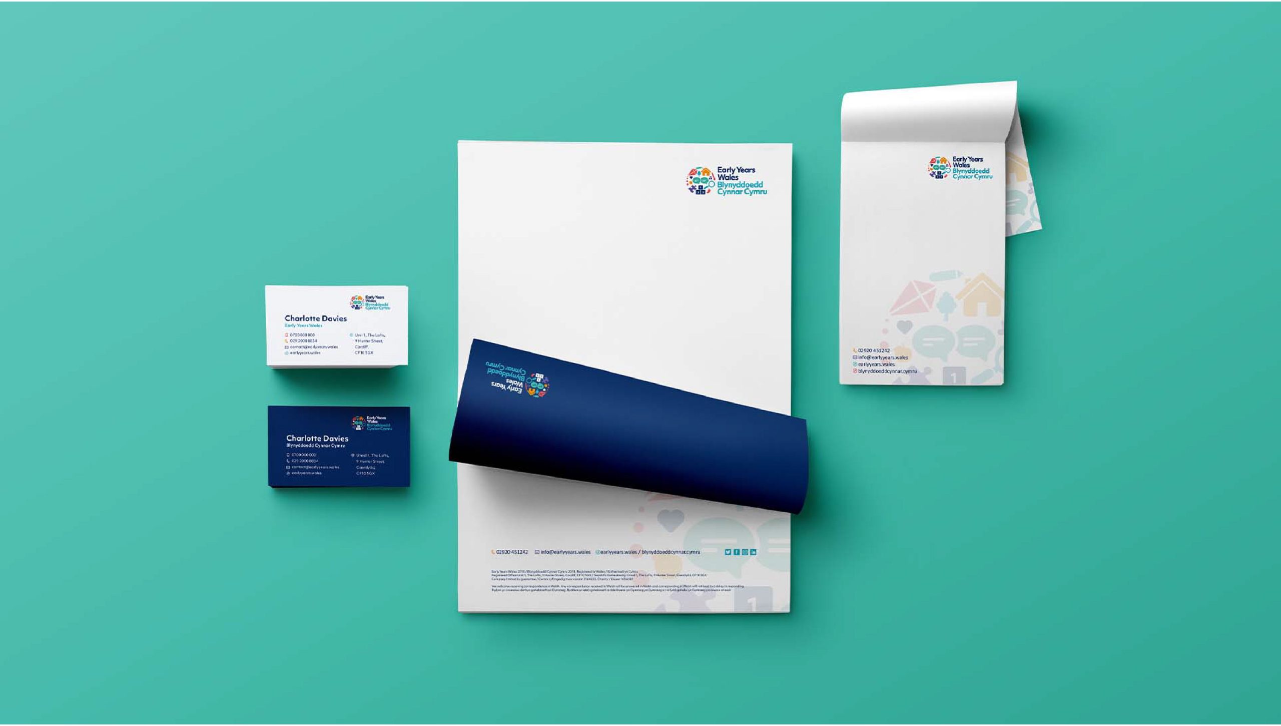
- Brand Identity Design
- Motion Design
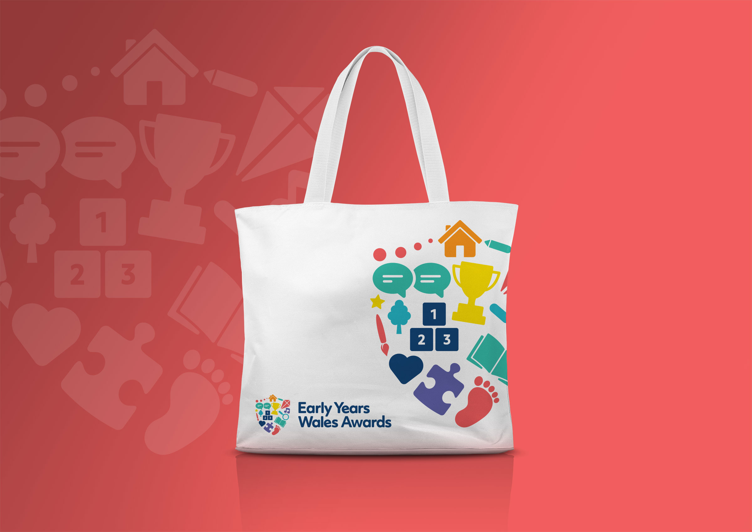
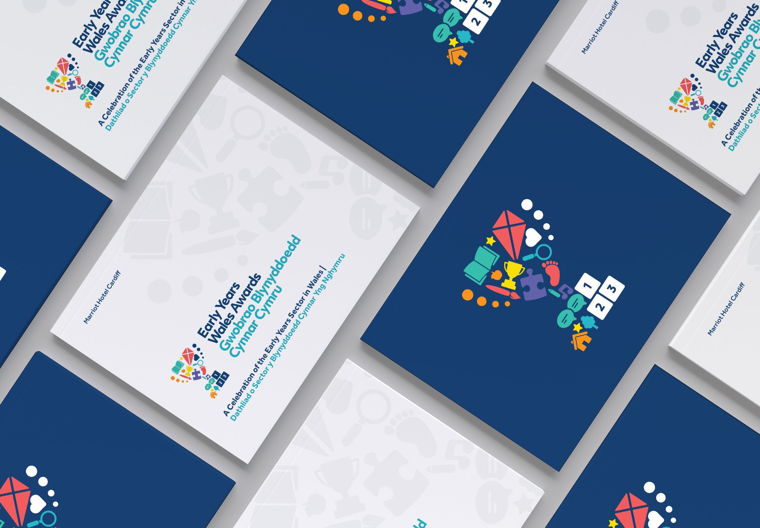
- Packaging Design
- Brand Guidelines
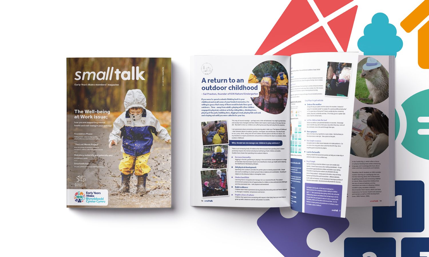
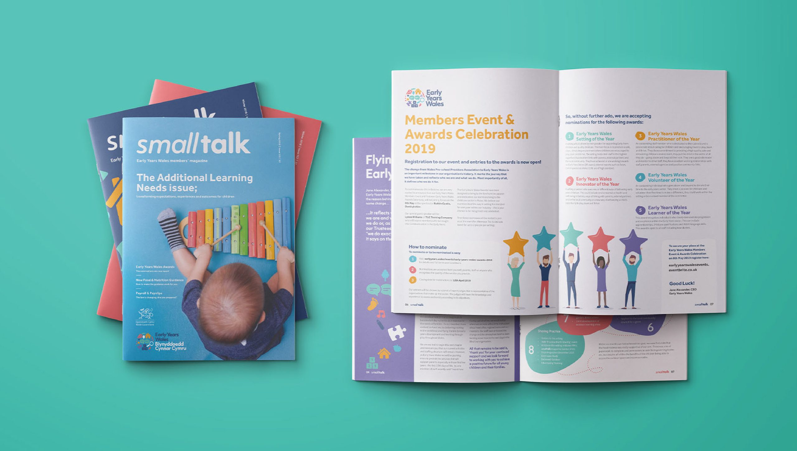
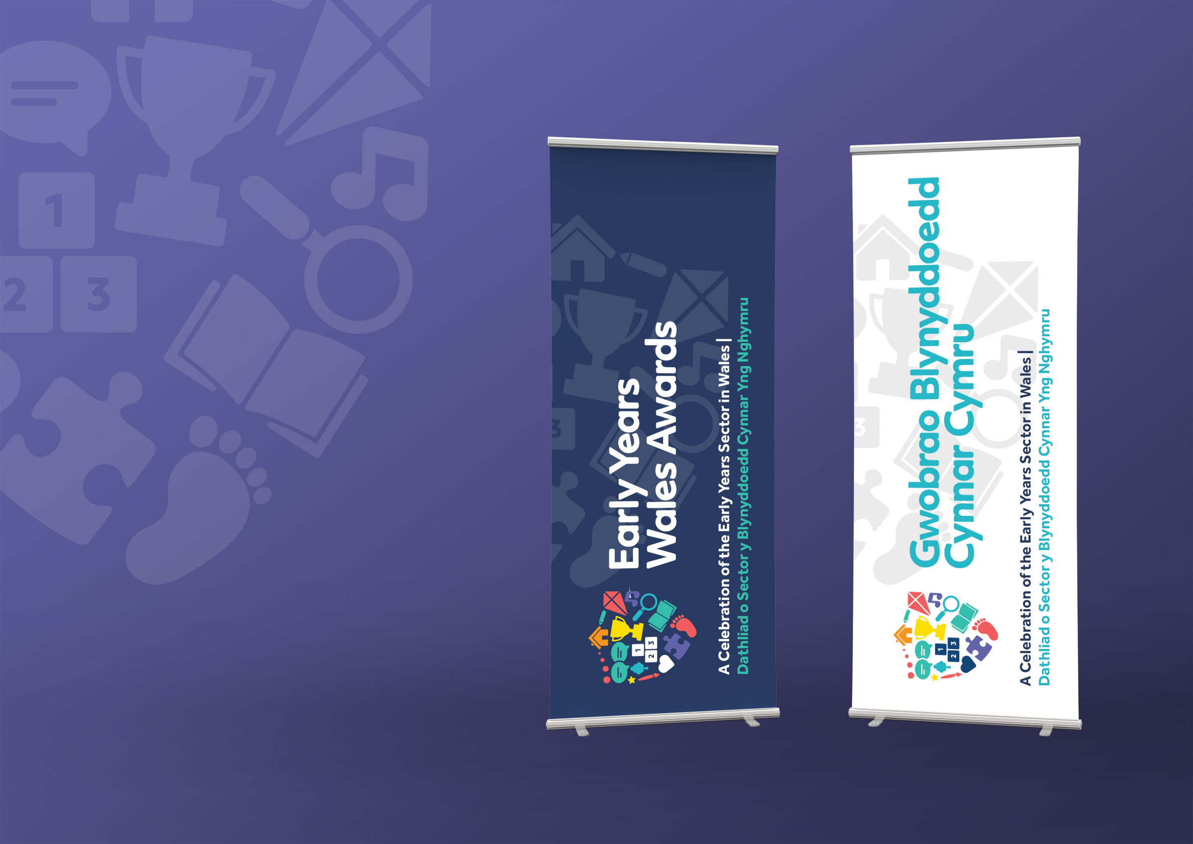
- Brand Collateral
- Brand Training
- Campaign Design
- Launch Support
When we first met with Early Years Wales, or Wales Preschool Providers Association as they were known then, they were at an exciting turning point.
Having simplified their key strategic objectives for sustainable growth, they were ready to forge ahead with renaming and rebranding the organisation in order to bolster and re-energise their aims, mission and vision for the future, ensuring they were headed forward with focus.
We recognised that in order for the organisation to reach a wider audience, and to further the remit of the organisation both internally and externally, the organisations’ dedicated and truly passionate internal culture would have to be properly acknowledged and consolidated. This would allow the sense of pride so apparent within staff and stakeholders to shine through the brand.
The rebrand offers a package that not only furthers the organisation and cements its positioning for the future by offering a timeless appeal, but also has the ability to instil a confidence, pride and recognition in all staff, stakeholders and members, that this is THEIR BRAND and that their voice is important, vital and most crucially, listened to. The iconography style is flexible enough to allow the charity to add in symbols for new services, ventures and objectives as time goes on and gives them the scope and impetus to be as progressive as they wish as the needs of children and members change over the years. The heart of the brand lies within its proposition; to see the children of Wales, PLAY. LEARN and ultimately, THRIVE. Yet this is also true for the vision of Early Years Wales as a progressive organisation; to be playful and experimental with their output, to learn from the past in order to shape the future, and to continue to thrive and develop as a valued charity within Wales.


Testimonial
What they said

You couldn’t do anymore for us. You always go above and beyond to help achieve our goals. I know I’ve said it before, but you’ve all been fantastic. over the past few months. We’ve had so many projects on the go, not just mine but I know you’ve been working with Emily also, on the Active baby stuff. To say this was Millie’s first project with you, then you should be really proud. I don’t know how’s she’s kept up with it all!!
Charlotte Davies
Communications and Marketing Co-ordinator
Early Years