 Slide
Slide
Bad Wolf
Cinematic by Design
Brand
- Brand Audit
- Discovery Workshops
- Stakeholder Engagement
- Brand Strategy
- Brand Positioning
- Brand Identity Design
- Motion Design
- Brand Guidelines
- Brand Collateral
- Campaign Design
Digital
- Website Audit
- Discovery Workshops
- User Journeys
- Website Strategy
- User Persona Profiling
- Information Architecture
- UX Design
- Wireframing
- UI Design
- Prototyping
- WordPress Development
- Frontend Development
- Website Training
- Launch Support
Bad Wolf doesn’t do average, and neither should their website.
The previous platform delivered the facts, but missed the feeling. We set out to create something bolder: a flagship experience that mirrors the scale, energy, and ambition of their work. From mobile-first design to a streamlined show portfolio and confident new identity, every element was built to lead. One voice, one experience – everywhere it matters.
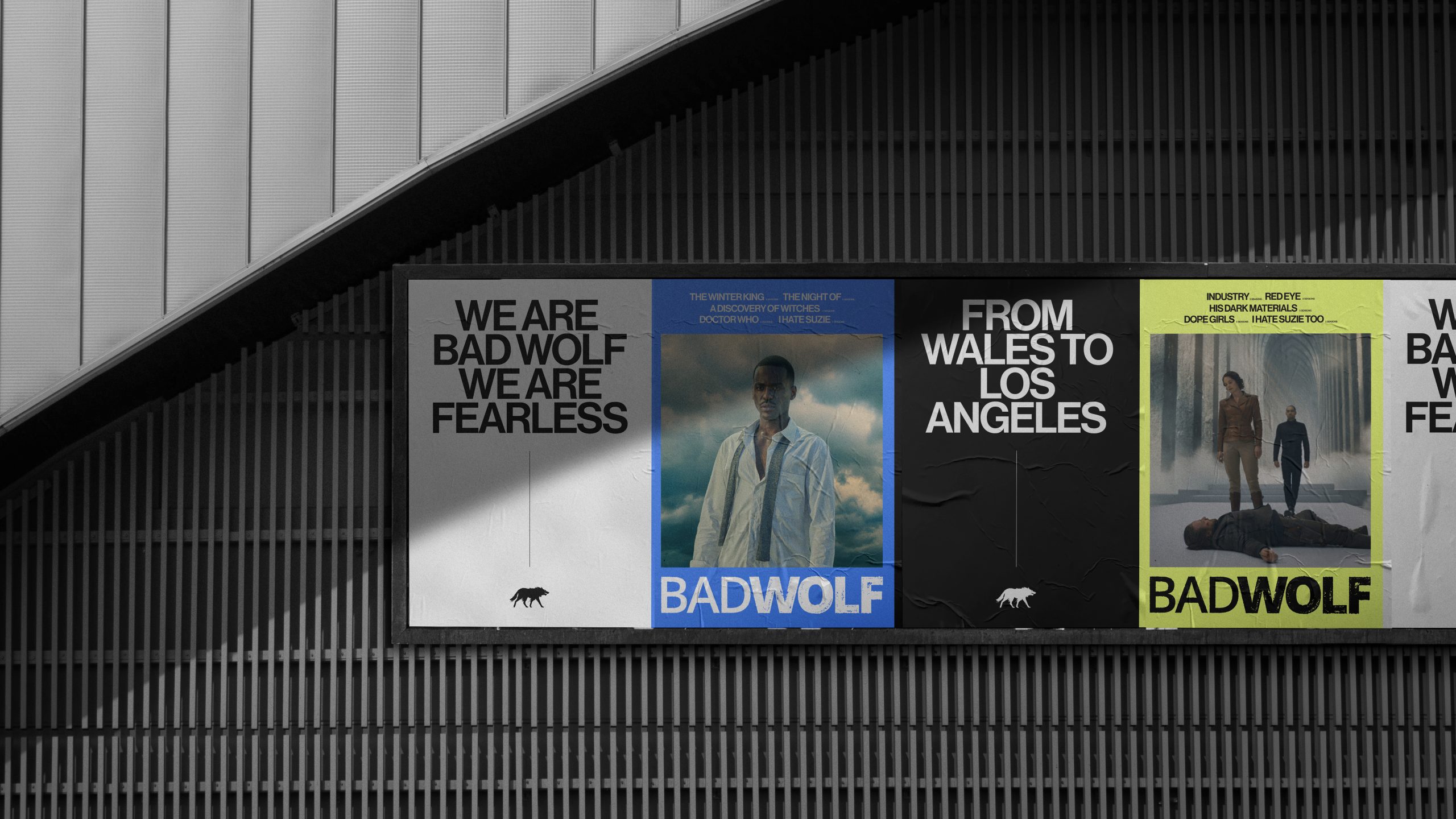
Sharper. Bolder. More Bad Wolf.
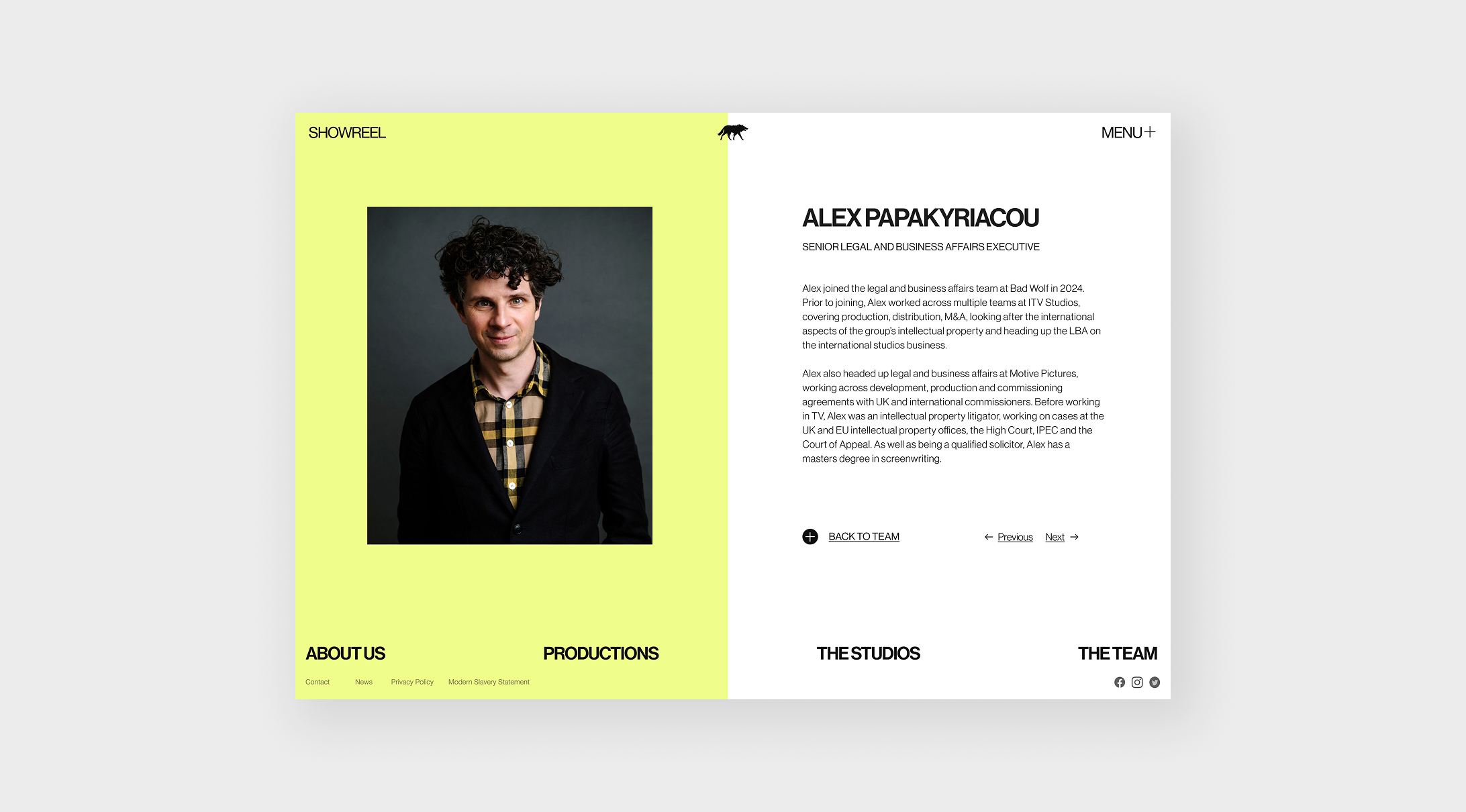
Before we touched a single pixel, we needed to sharpen the brand’s edge. The brand had strength – but not cohesion. It felt more like a collection of parts than a clear, unified whole. So we went back to the foundations: bold, confident typography, a refreshed colour palette, and a cleaner structure. Not to chase trends, but to build something cohesive, charismatic, and unmistakably Bad Wolf.
This first step was about crafting a visual identity as compelling as the stories Bad Wolf tells, consistent across the site, socials, marketing and beyond. Because if a brand doesn’t move with confidence, the audience won’t follow.

Bold Design Meets Visual Storytelling
The previous site had plenty to say – but not always in the most compelling way. Our job was to shape the story with more intent. To elevate the experience from static to cinematic.
We refined the content, introduced rhythm, and let design do more of the storytelling. Think bold, film-style typography layered over imagery, a modern visual system full of motion, and confident use of colour, hovers, and video. Dynamic layouts, purposeful movement, and interactive details turned a passive scroll into an active experience.


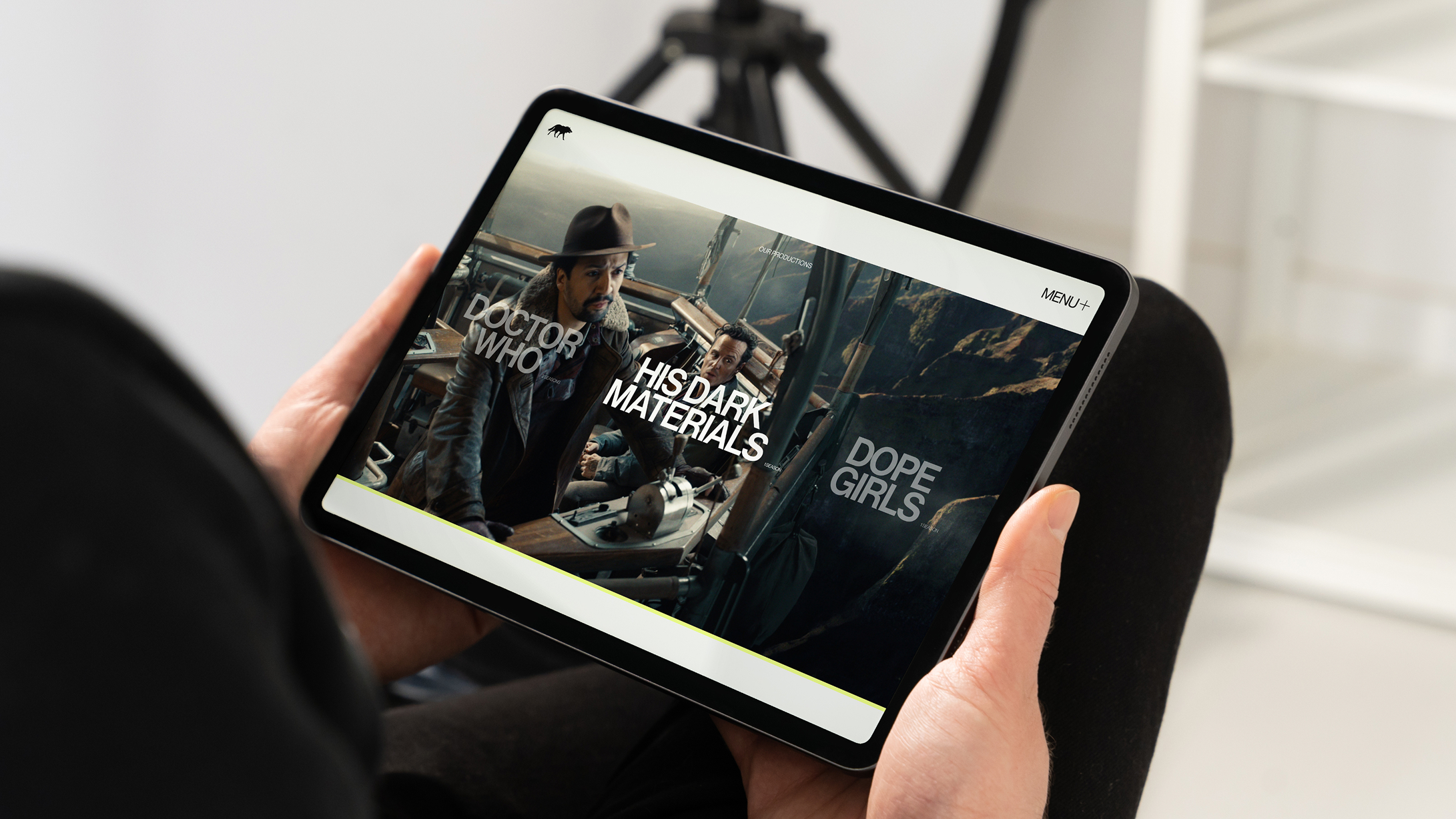
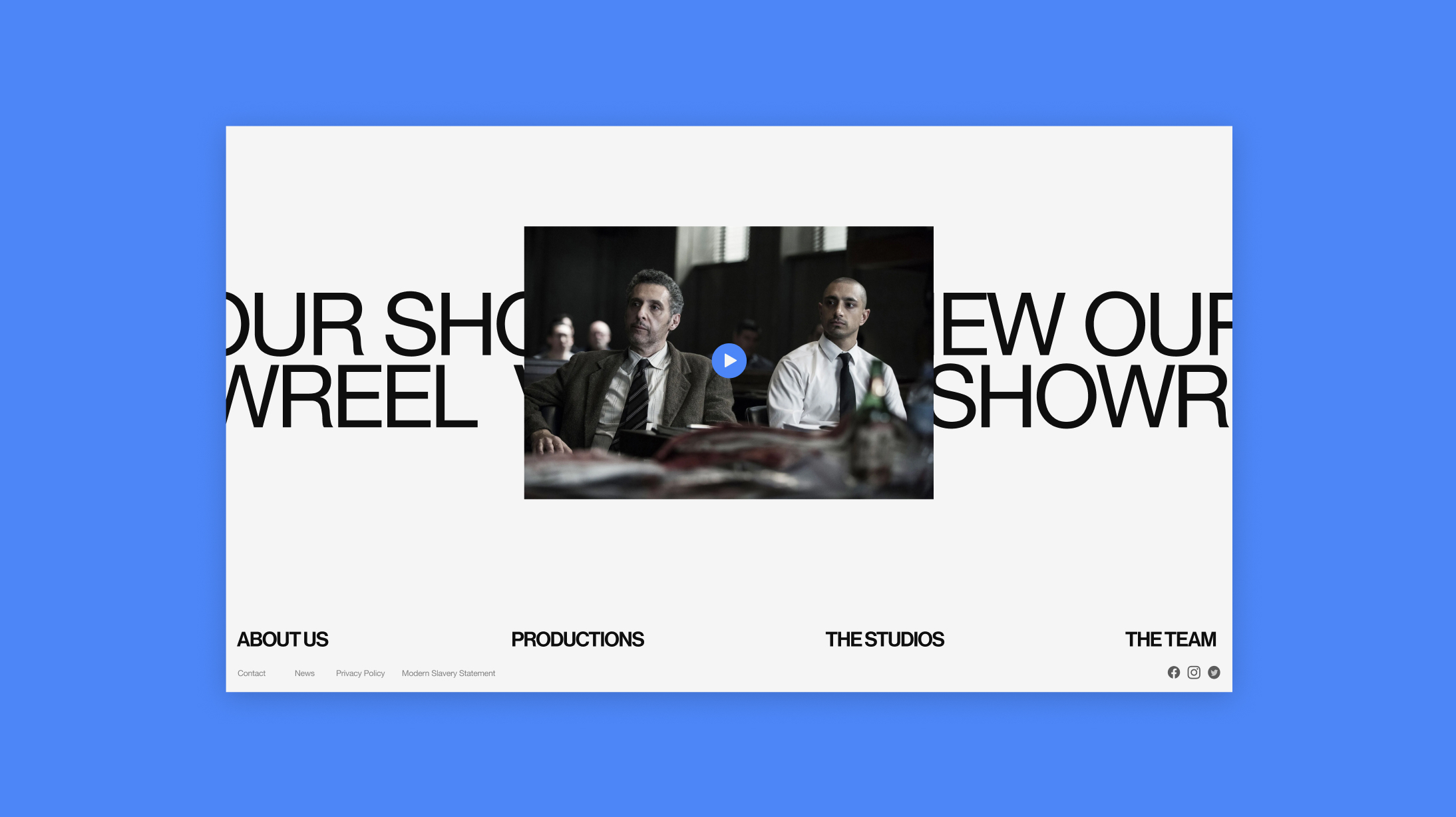
A portfolio that does the shows justice.
We designed a dedicated space to showcase Bad Wolf’s slate. Not just to inform, but to impress. Enhanced functionality makes it easy to navigate, explore, and dive into each production, with up-to-date details on cast, writers, and visuals.
Each show now has the stage it deserves. Brought to life with modern, dynamic design that mirrors the energy, ambition, and scale of the stories themselves.

Optimised for Every Screen
Analytics showed us 75% of visitors arrived on mobile. But the old site didn’t treat them like a priority.
We flipped the approach, designing mobile-first from the ground up. Every scroll, swipe, and tap was considered, ensuring the experience felt just as intentional in your hand as it does on a large screen.
Animations were optimised to stay smooth. Typography held its weight. Hierarchy stayed sharp. And nothing was lost in translation – the desktop experience remained just as bold, cinematic and seamless.

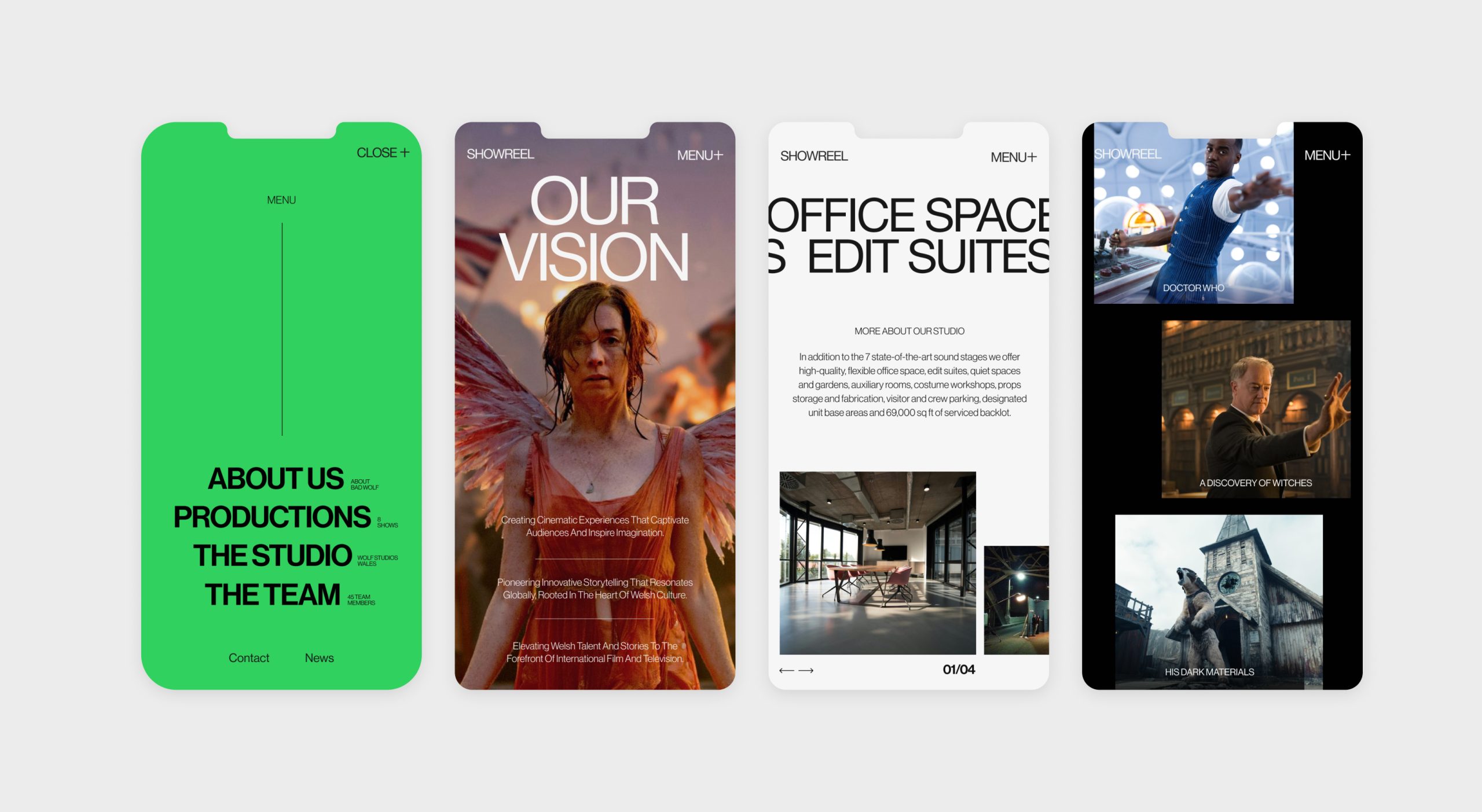
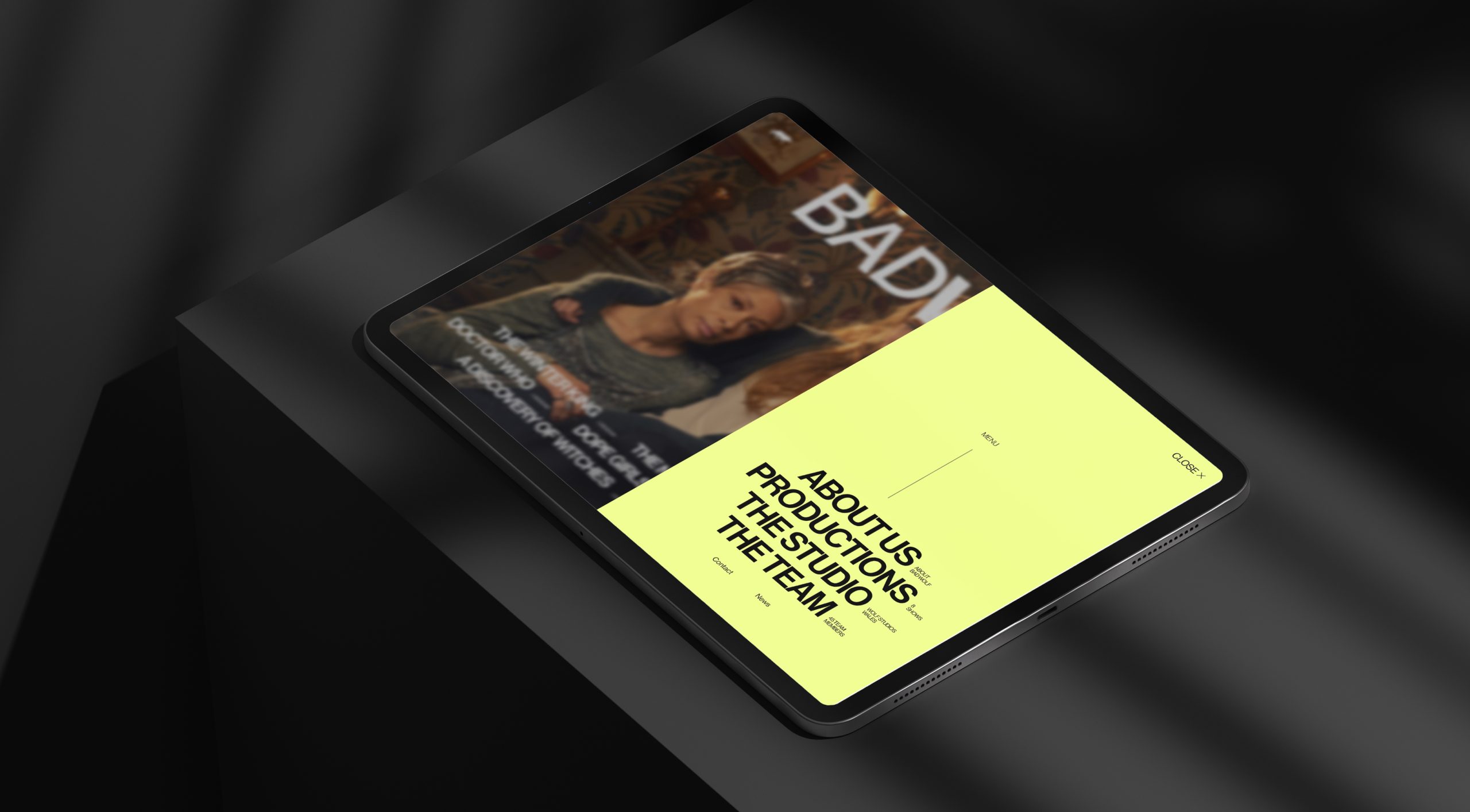
Navigation that leads, not overwhelms.
The original structure gave everything equal weight. Which, in practice, meant nothing stood out. We reworked the hierarchy from the ground up, clearly defining what’s primary, what’s supporting, and what can sit quietly in the background.
The result? A seamless, intuitive journey that guides users to what matters most, faster. Cleaner paths, clearer priorities, and no more digital dead ends.


