Handshakr
The way B2B, ought to be.
Brand

- Competitor Analysis
- Brand Audit
- Discovery Workshops
- Stakeholder Engagement
- Brand Strategy
- Audiences Analysis
- Brand Positioning
- Brand Identity Design
- Motion Design
- Brand Guidelines
- Brand Collateral
- Campaign Design
- Launch Support
Digital

- Discovery Workshops
- User Journeys
- Website Strategy
- Information Architecture
- UX Design
- Wireframing
- UI Design
- WordPress Development
- Frontend Development
- Backend Development
- Website Training
- Launch Support
- SLA
Handshakr’s service had gone through many developments in the year before working with us, and so naturally, their brand and website needed to follow suit.
As an ever-evolving, progressive company, we were on their journey with them and a brand refresh was essential to realign their offering with their new brand image.
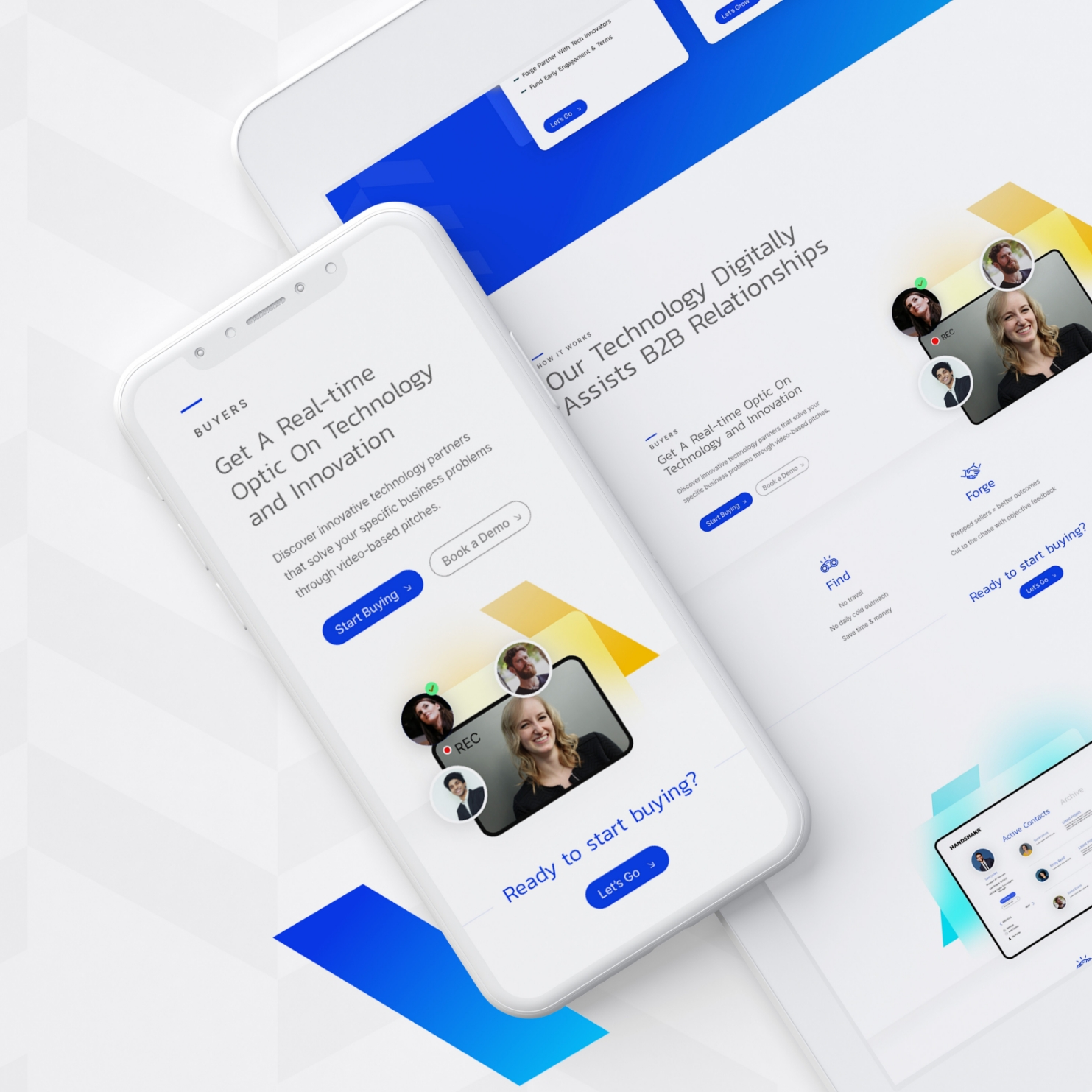
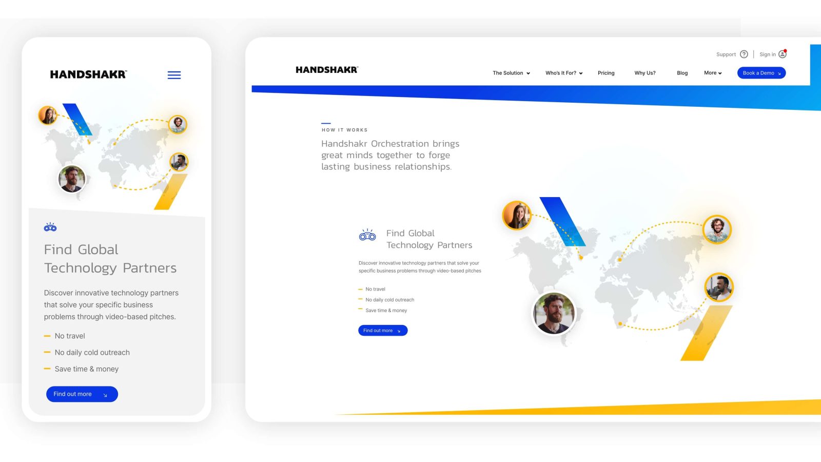
Their brand and website had to be a space to collaborate easily and freely. A hub to source and sell technical innovation and to develop the right partnerships. This website would need to be relationship-driven, with the user journey at the absolute heart of it.
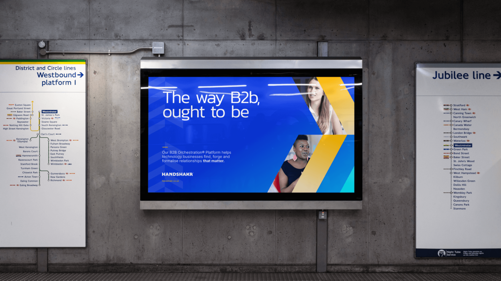
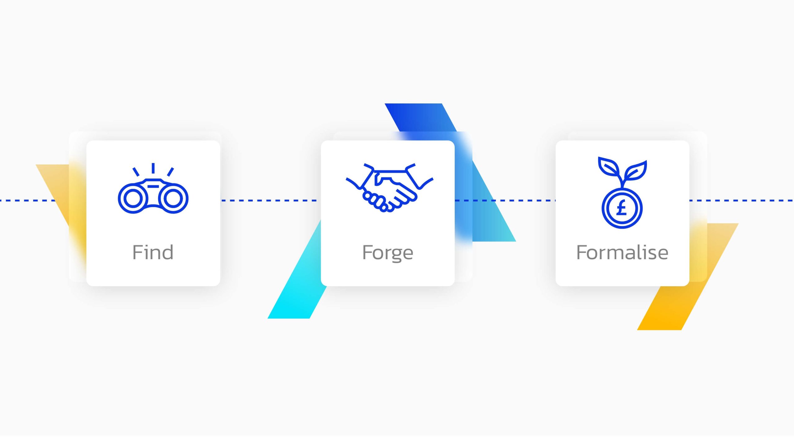
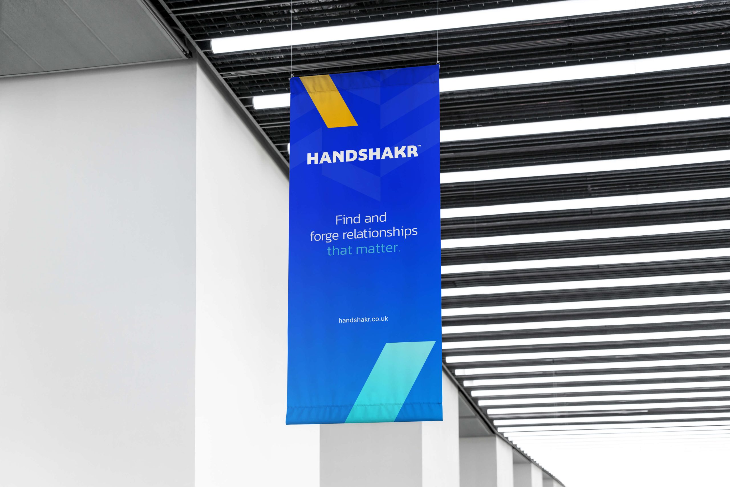
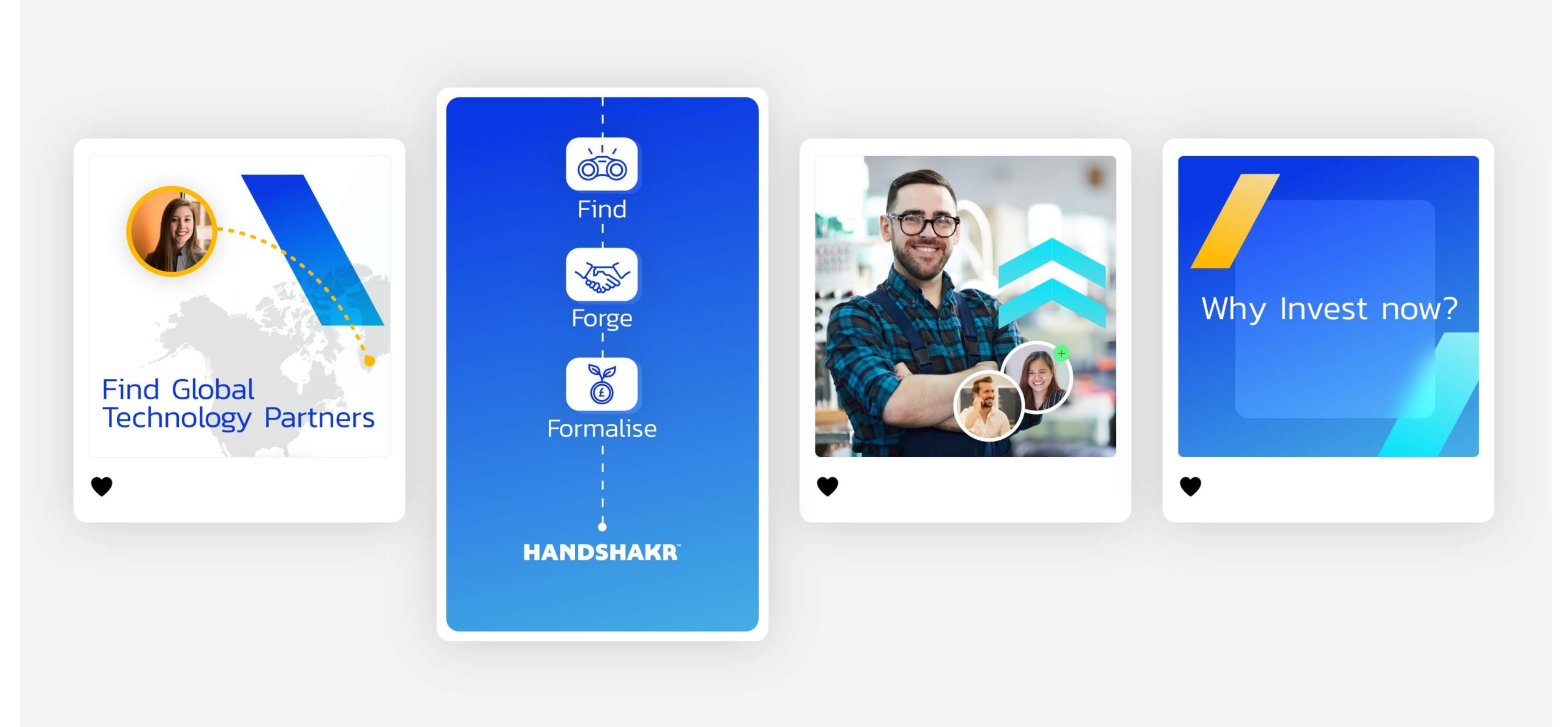
This project was about evolving, and not re-inventing. So, we stripped away the icon from the current logo and added a new colour palette with accompanying brand assets (chevrons, shapes, drop shadows, overall layout and look & feel). By adding the chevron device, we were able to add a sense of progression, motion and movement to the brand. By accompanying this with blurred blocks, drop shadows and rounded corners, the brand was able to feel forward-thinking and future-driven.

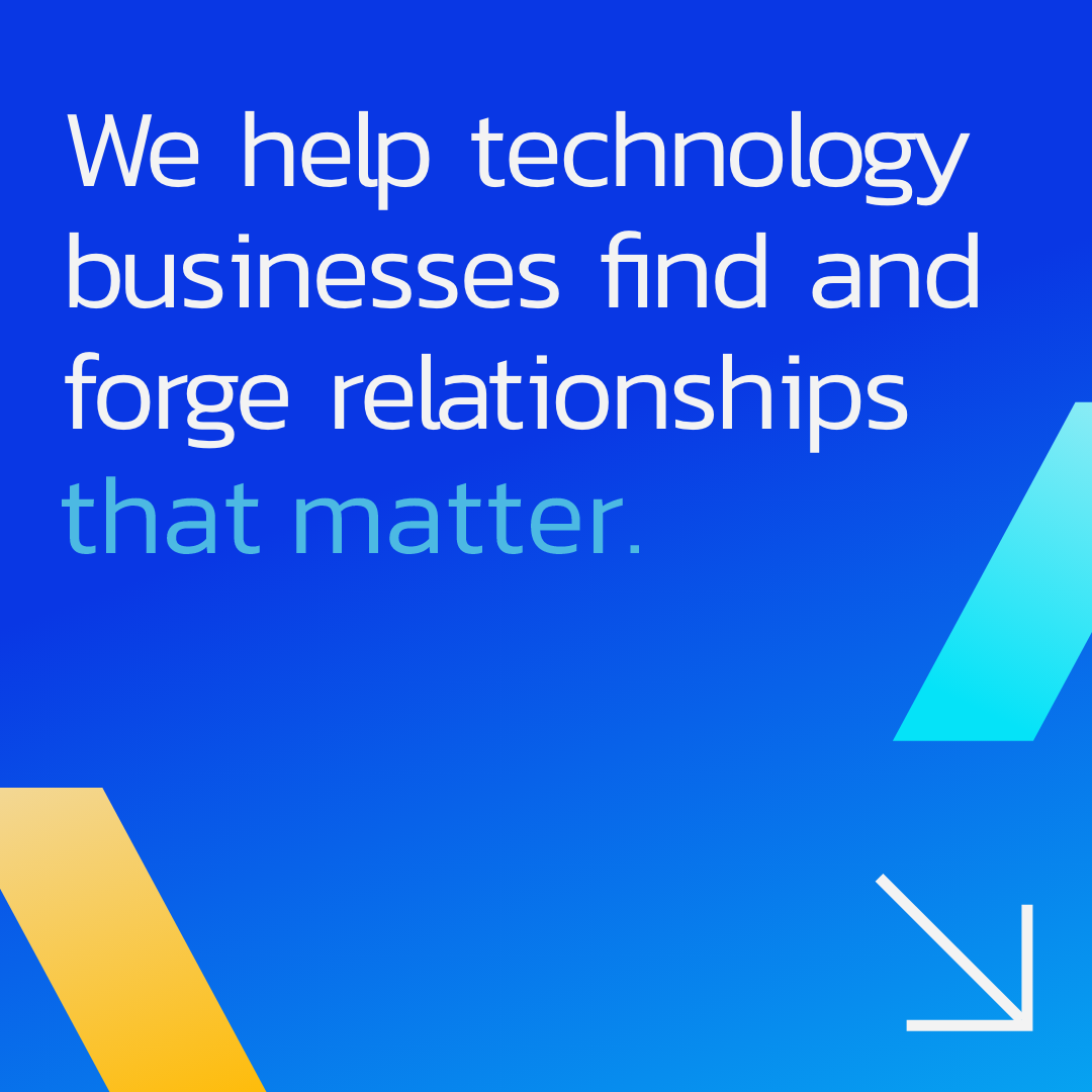

Inspired by movement, we designed a suite of chevron devices for the brand that move, evolve and combine to represent the idea of progression & development; helping relationships to be forged easily.
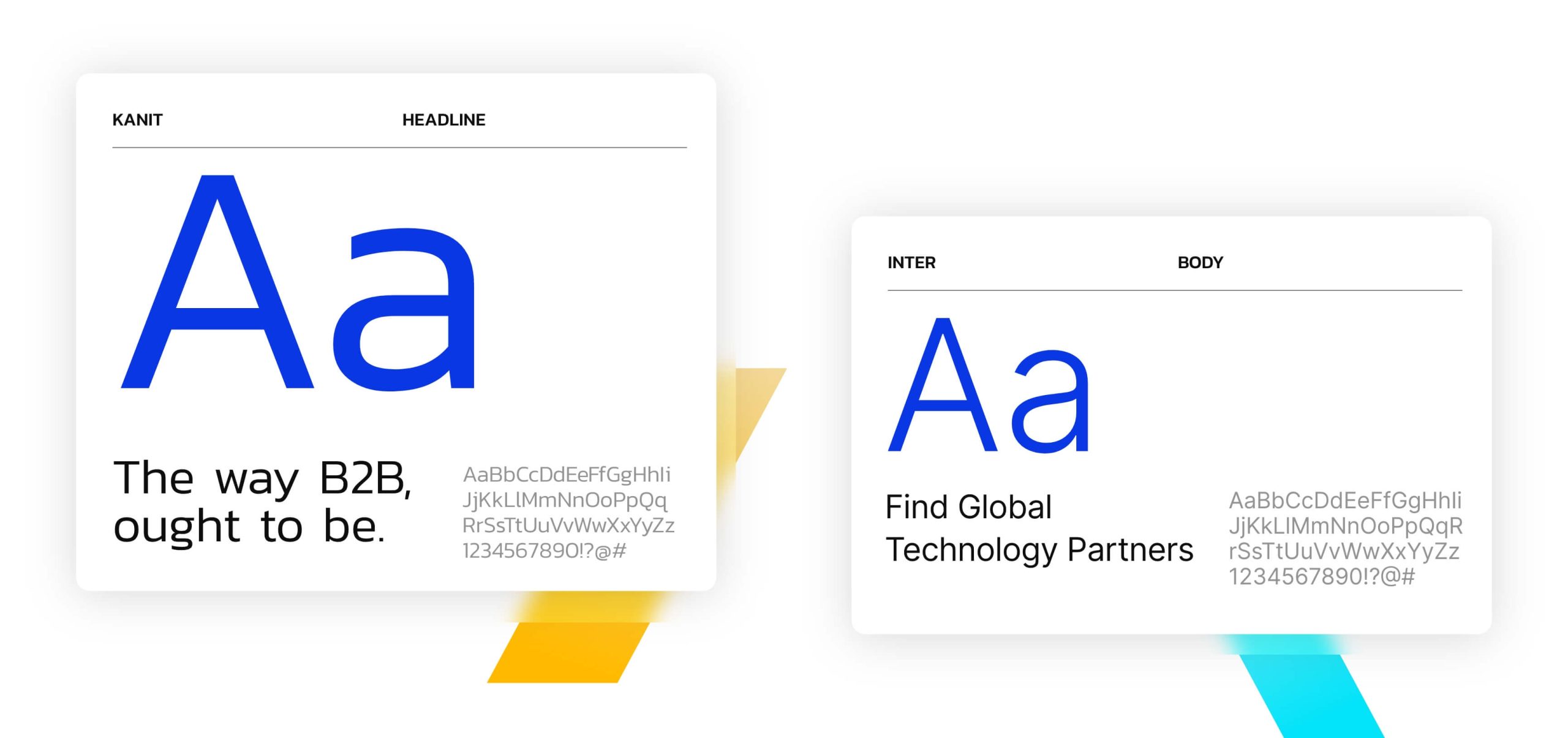
Along with a vibrant colour palette and strong typographic system, the identity of other SASS competitors through a more dynamic and bold design language.



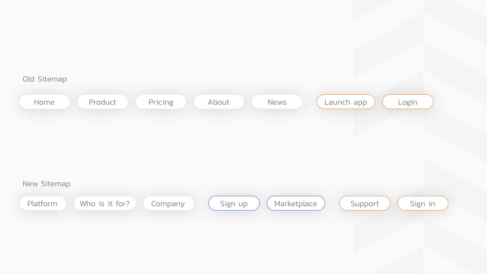
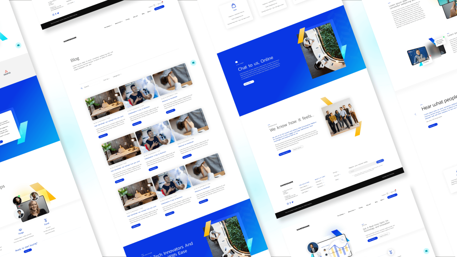
The website, in its current form, was complicated and muddled and not easy to digest. The navigation system and general website content structure needed to be thought through again.
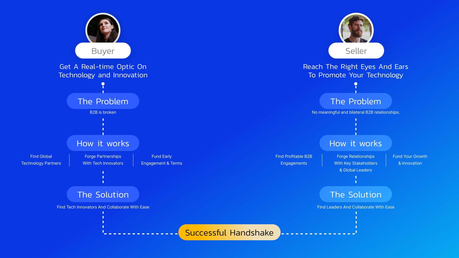
By stripping the current website right back and aiming the content towards the two target audiences (buyer & seller); the content became a lot clearer and was easier to tailor and target towards a specific audience.
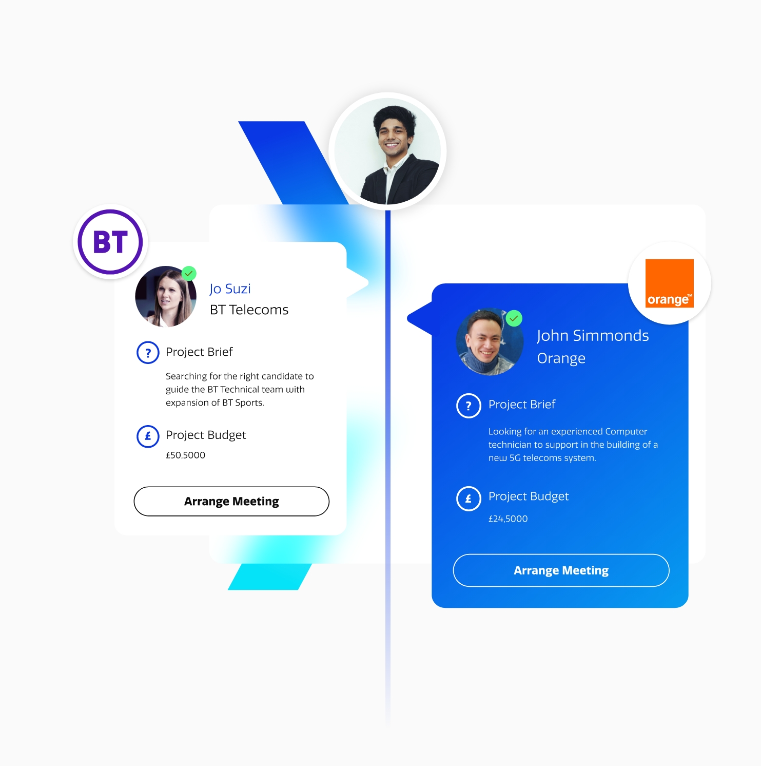
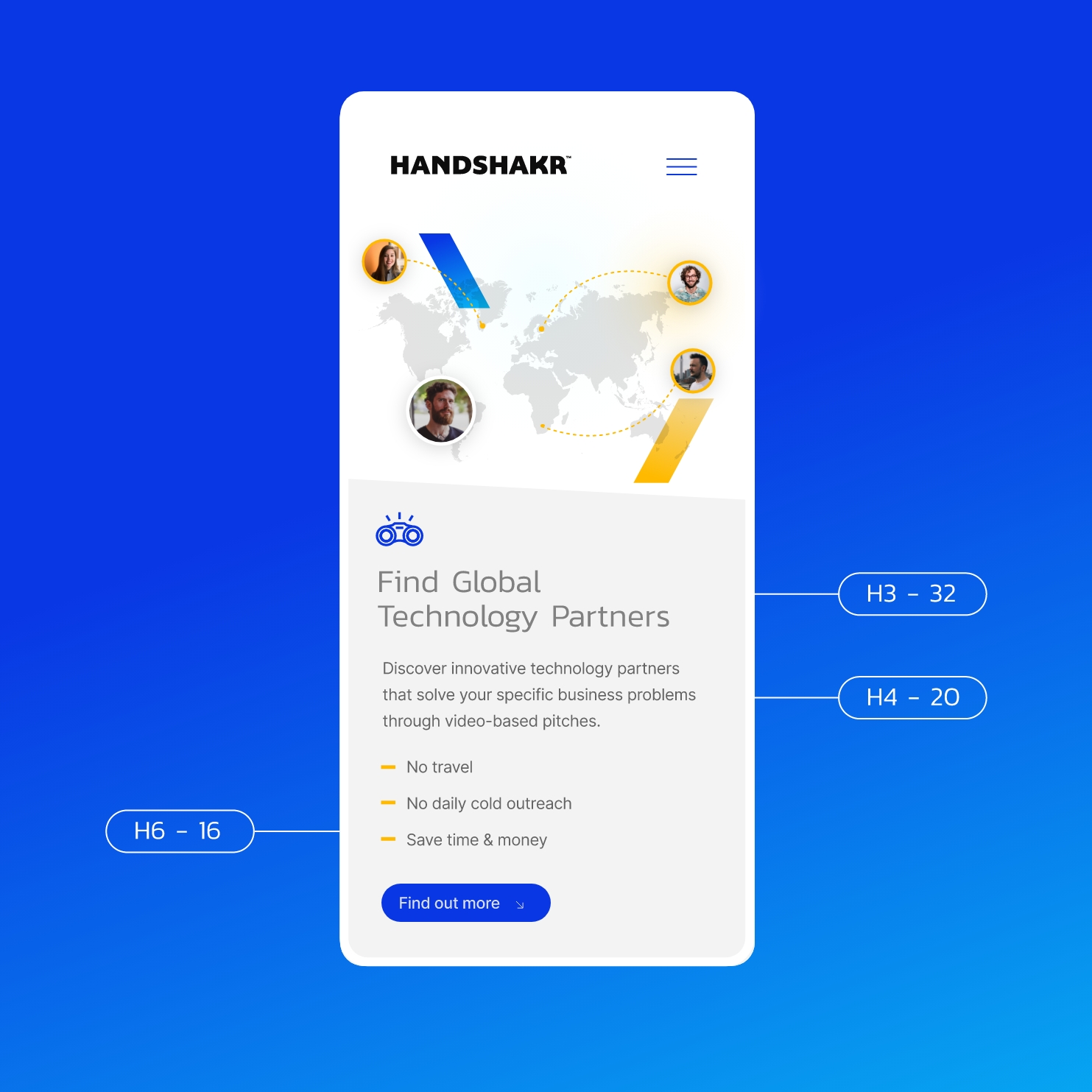
In order to create a more seamless customer experience, the updated branding needed to feed directly into the design of the product.
We worked closely with the client to produce a set of styles and elements that neatly tie the brand into the product.


 Slide
Slide


