Health & Her
Award winning approach to female health
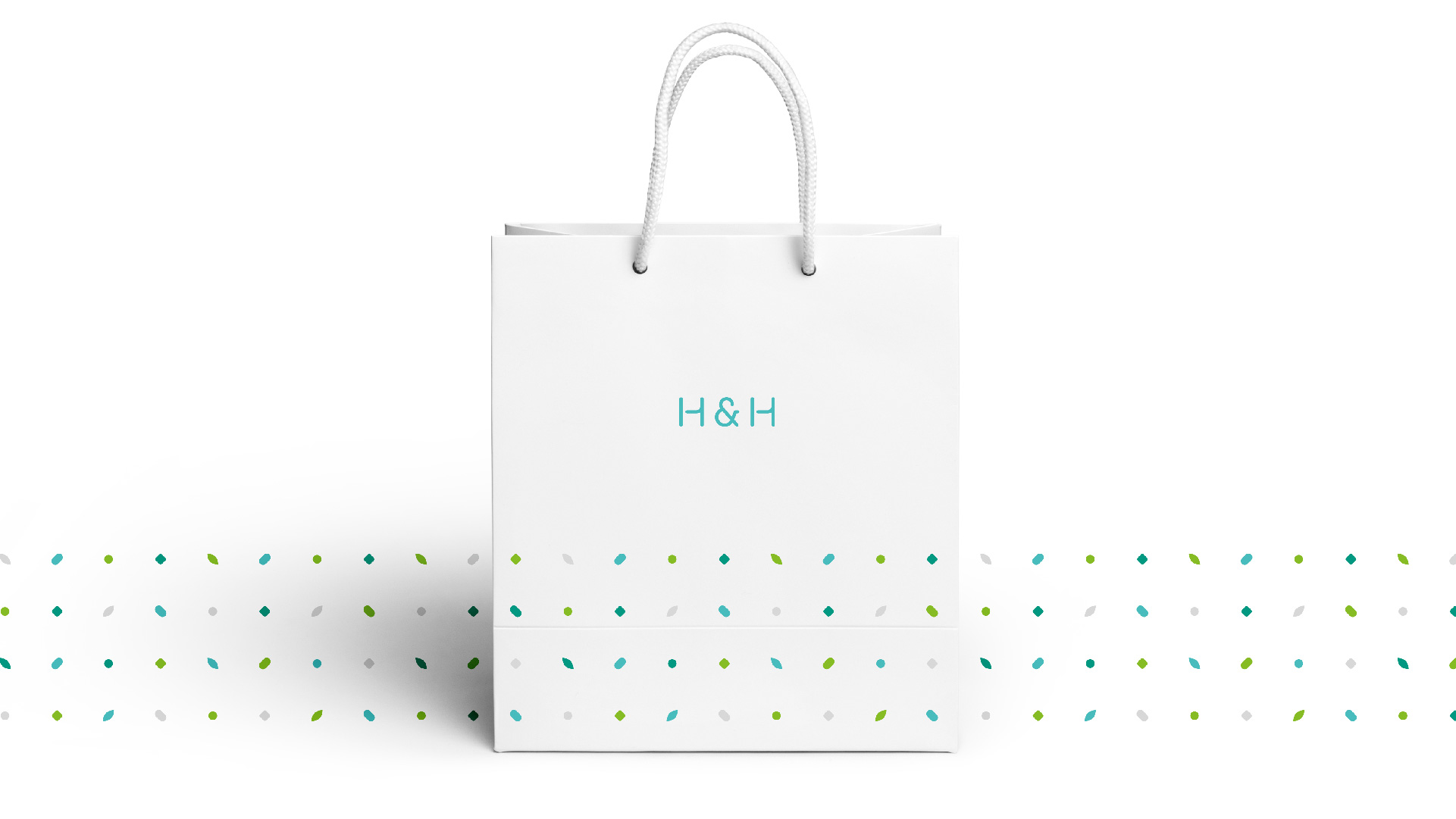
Brand
- Brand Audit
- Discovery Workshops
- Stakeholder Engagement
- Brand Strategy
- Brand Naming
- Audiences Analysis
- Brand Positioning
- Brand Identity Design
- Packaging Design
- Brand Collateral
- Brand Training
- Campaign Design
Digital
- Website Audit
- Discovery Workshops
- User Journeys
- Website Strategy
- User Persona Profiling
- Information Architecture
- UX Design
- Wireframing
- UI Design
- Prototyping
Founded by Gervaise Fay and Kate Bache, two successful Brand and Marketing specialists, Health & Her was set up to bridge the gap so apparent on the internet; where accessible and easy-to-understand information on everyday female health was underpinned by accredited and unbiased medical facts.
With the surge of social media as a key marketing tool over the past 10 years, Women have become used to being bombarded with advice dealing with everything from the way they choose to dress, definitions of beauty and even what constitutes a ‘healthy relationship’.
Yet everyday female health issues such as menstruation and menopause remain the ‘unsexy’ topics of conversation, seldom touched on by mainstream media, and often left to the medical community to advise on, generally delivered with a lack of empathy and understanding.
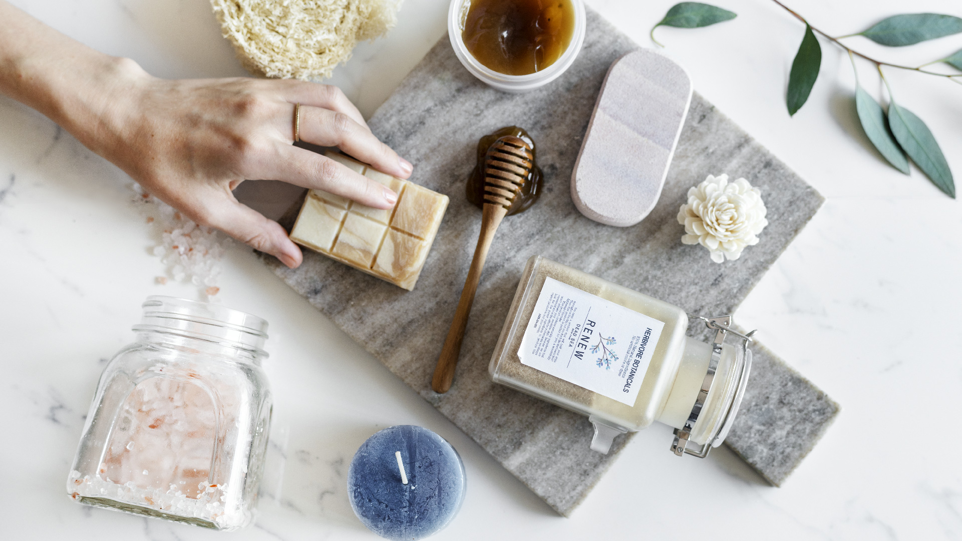
Health & Her has become a comprehensive, trusted and dedicated source of unbiased information and advice, and so they needed a brand voice and visual that would empower women to take control of their everyday feminine health and confidently manage their symptoms. Anything that seemed too ‘clinical’ was immediately scrapped in favour a marketable ‘lifestyle brand’ appeal, and tone of voice and strategy points were solidified as empathic, affable and approachable.
A relaxed, caring, supportive and encouraging tone-of-voice is balanced by the brand aesthetic; inspiring trust without being overly medical. The brand can be tweaked with simple, vibrant colour changes to differentiate between audiences or topics, allowing the visual to grow along with the aims and ambitions of the company.
Health & Her was created to make a difference, not only to the women that use their service, but to the way the industry tackles everyday female health issues in general.