Joe’s Ice Cream
100 years of ice cream making
Brand

- Competitor Analysis
- Brand Audit
- Discovery Workshops
- Brand Strategy
- Brand Positioning
- Brand Identity Design
- Motion Design
- Packaging Design
- Brand Guidelines
- Brand Collateral
- Brand Training
- Campaign Design
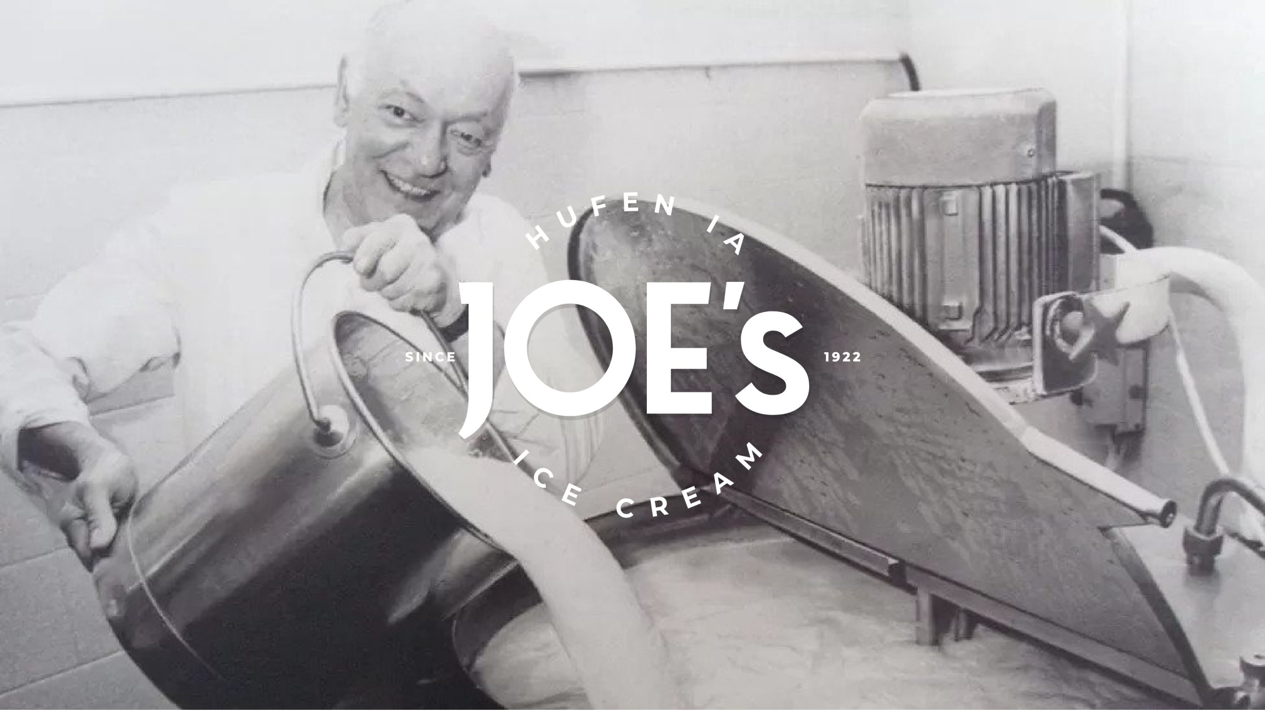
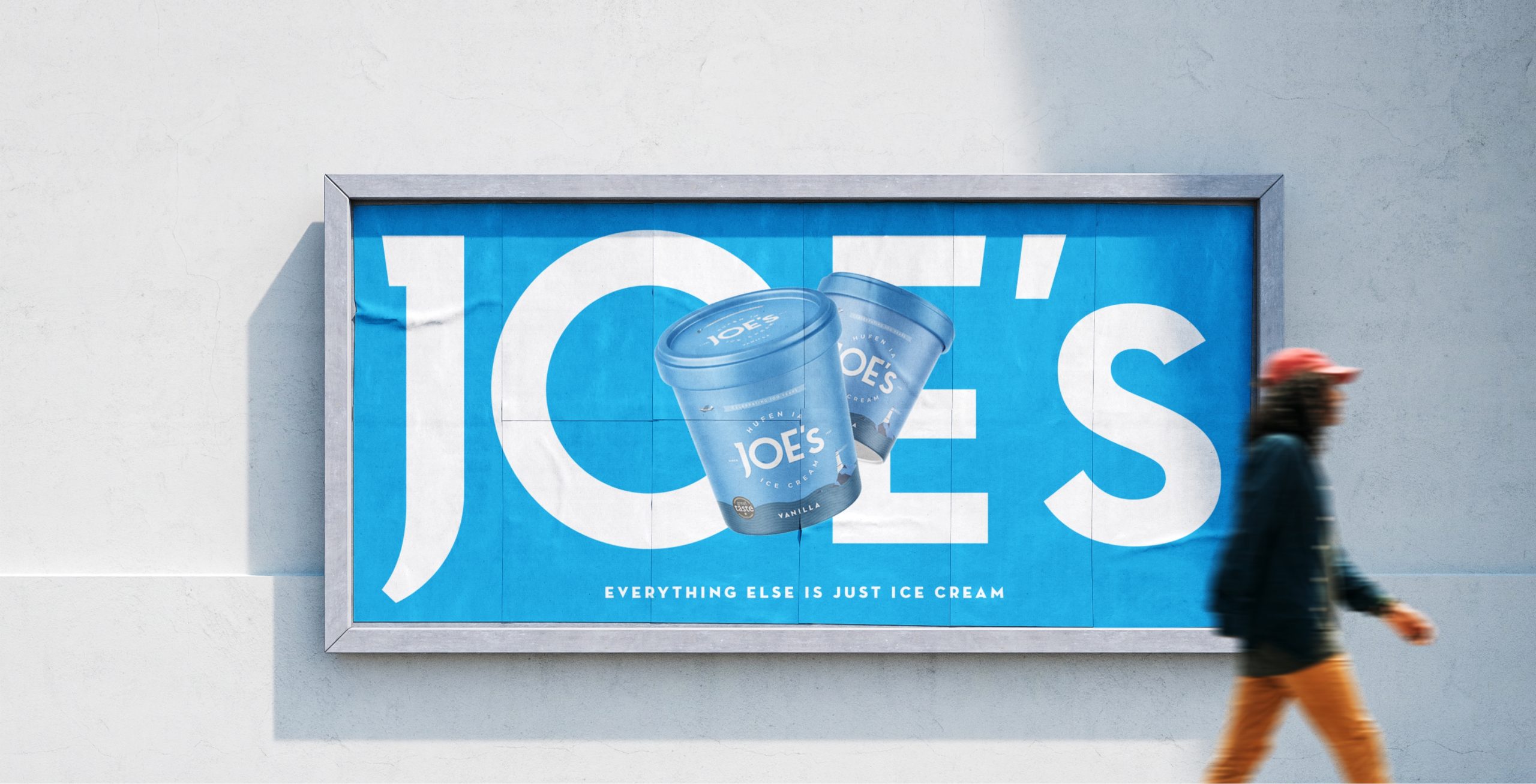
100 years is a monumental milestone for a brand. A moment to be celebrated, and also an opportunity to signal continued growth and innovation. Joe’s looked to a brand refresh, to make the most of this significant achievement.
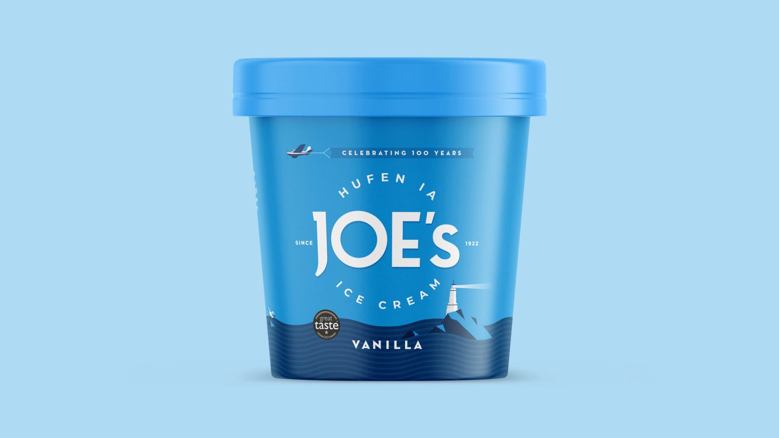
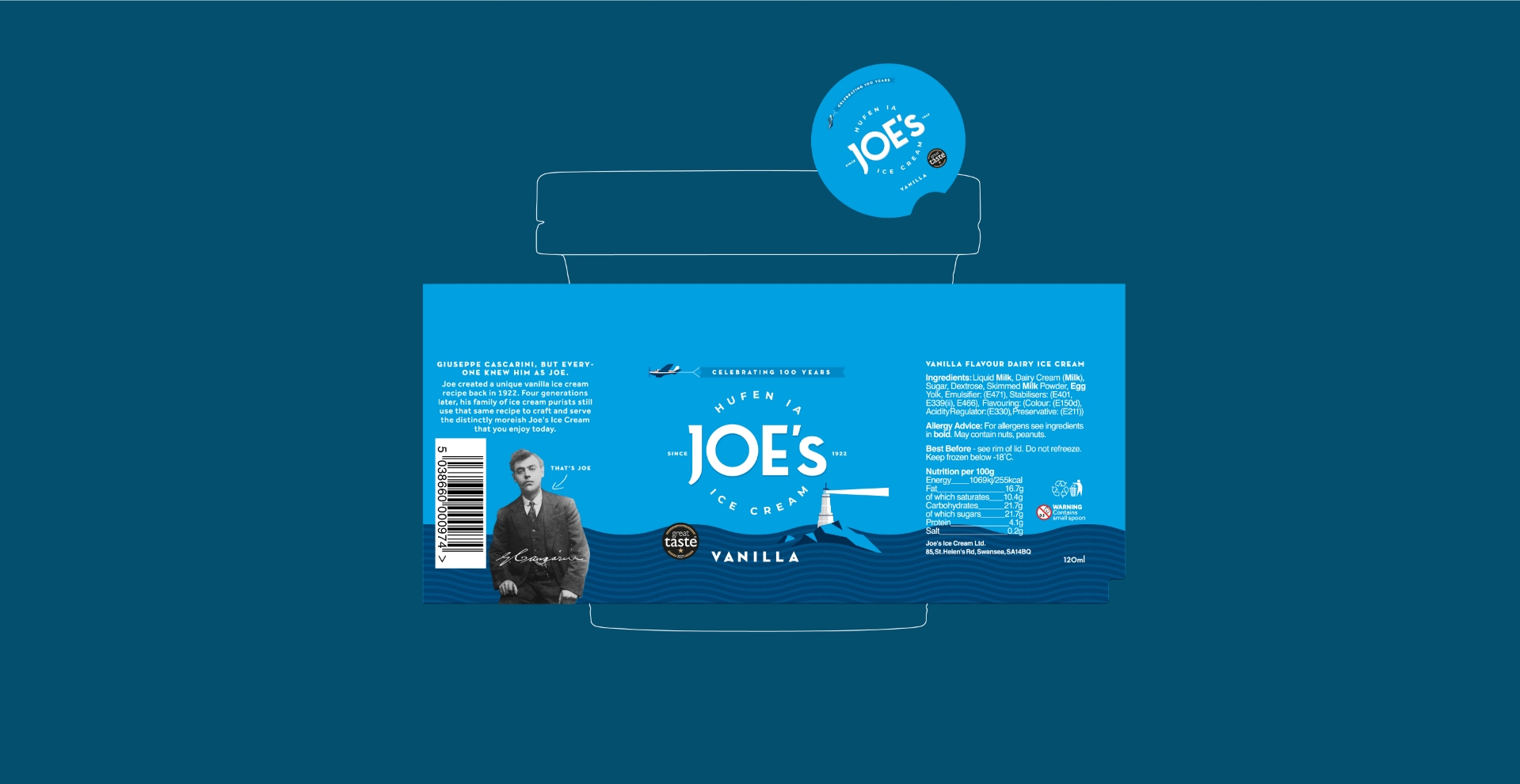
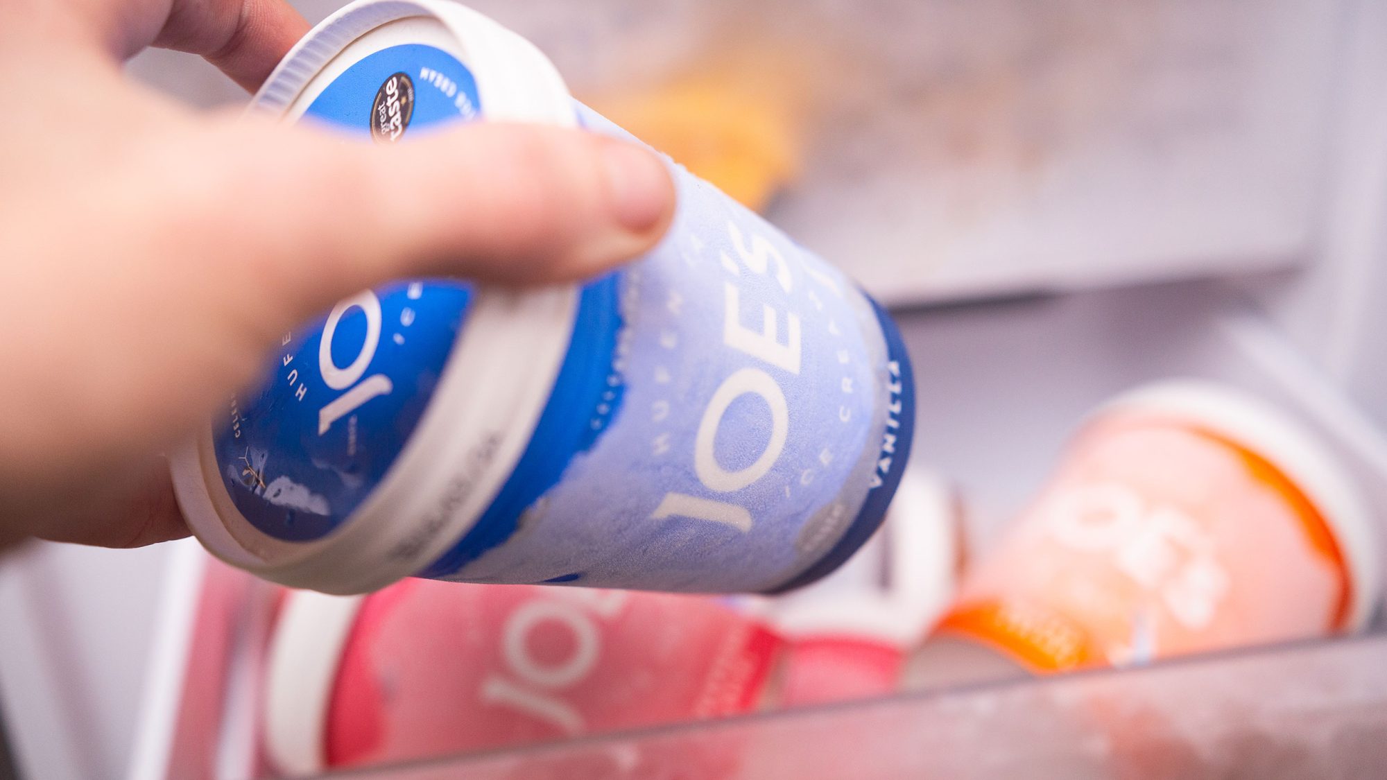
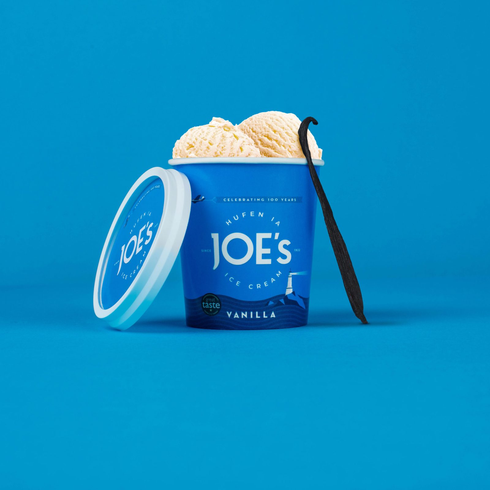
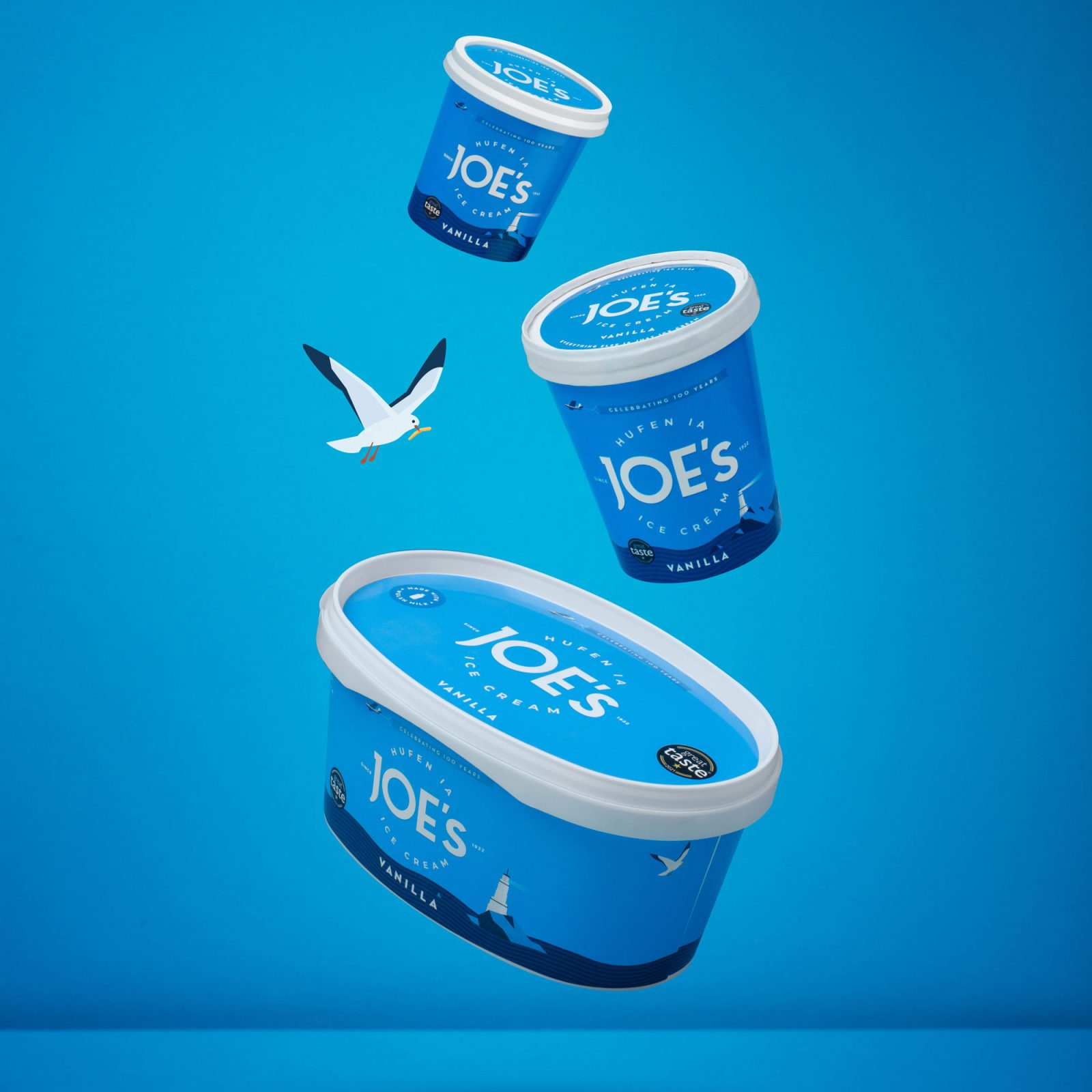
But it was essential to preserve Joe’s recognisable brand DNA. In well-established heritage brands, brand associations are long-held and deeply rooted. There is power in connecting your past to your present and future. At the same time, a gear change was needed, to appeal to the next generation of customers. We moved the brand colours back towards their original blue, but used more contemporary, clean styling, to move the brand forward, reflecting progress.
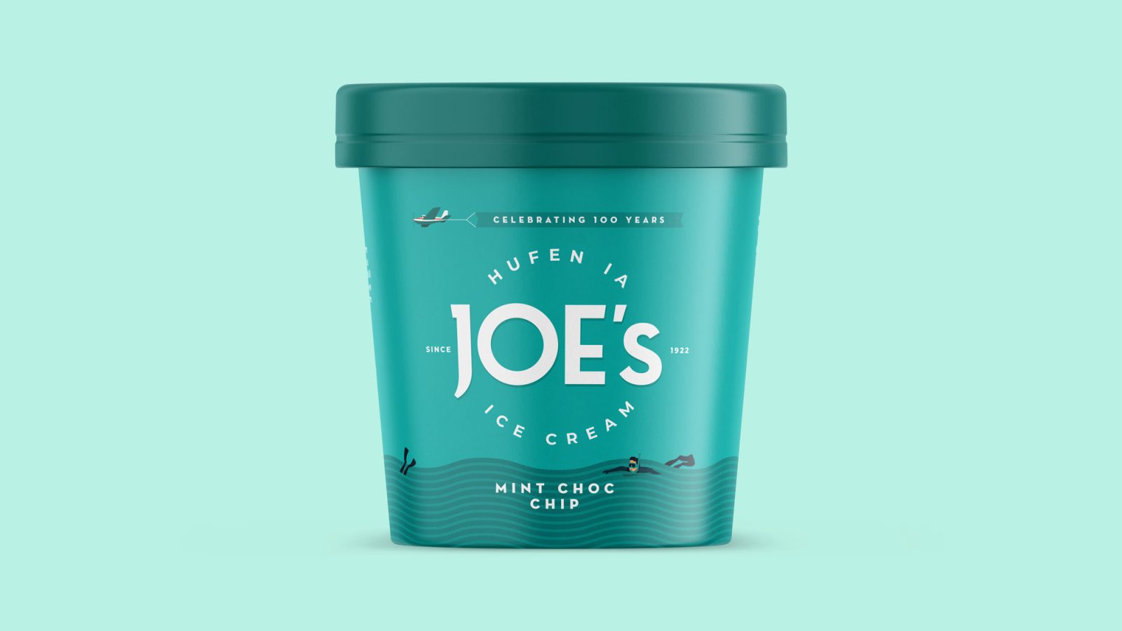
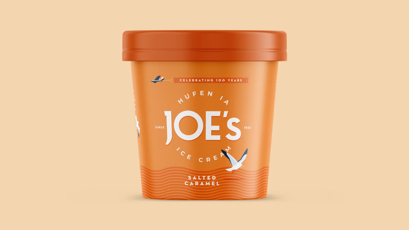
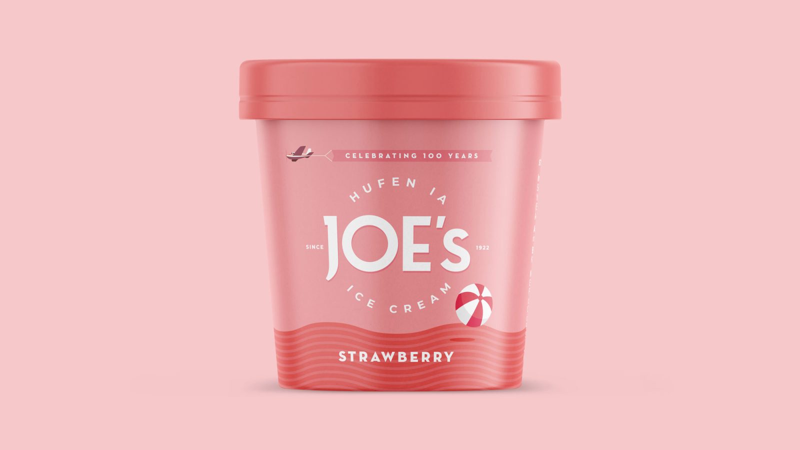
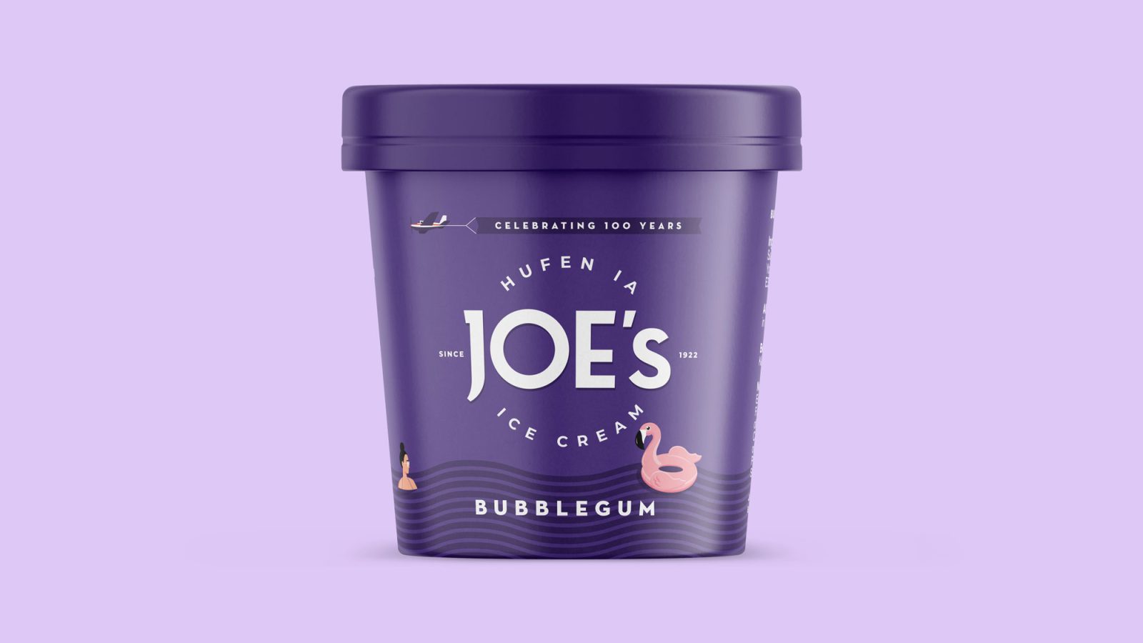
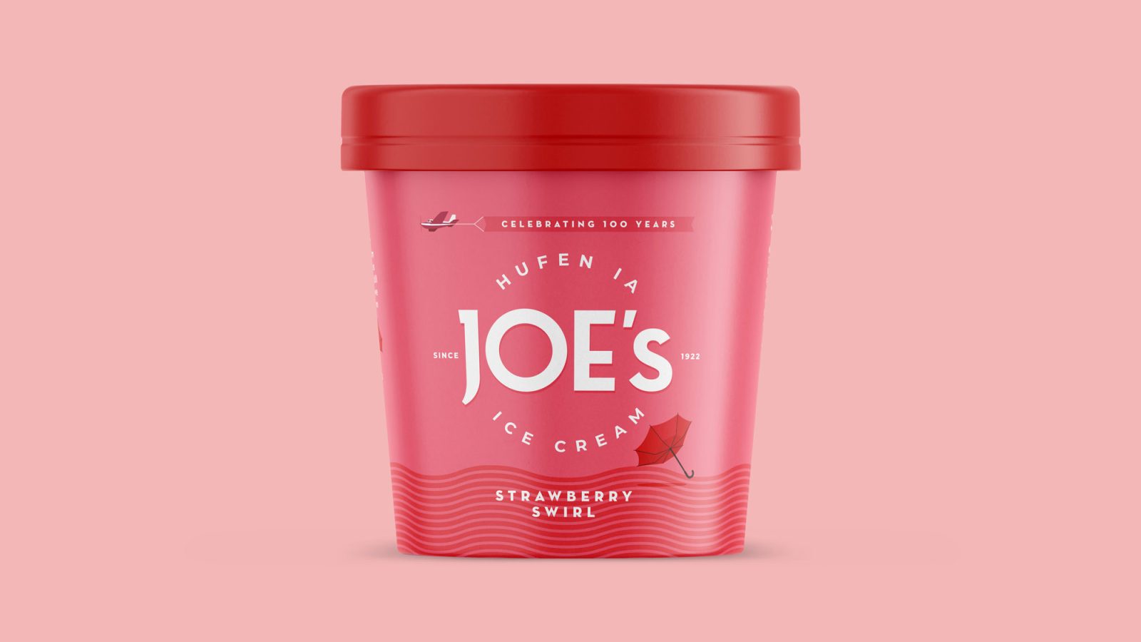
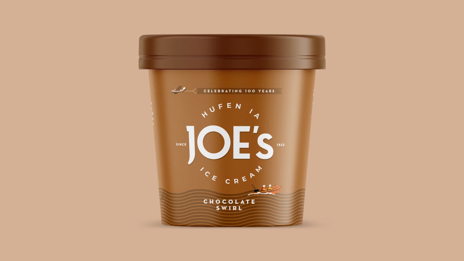
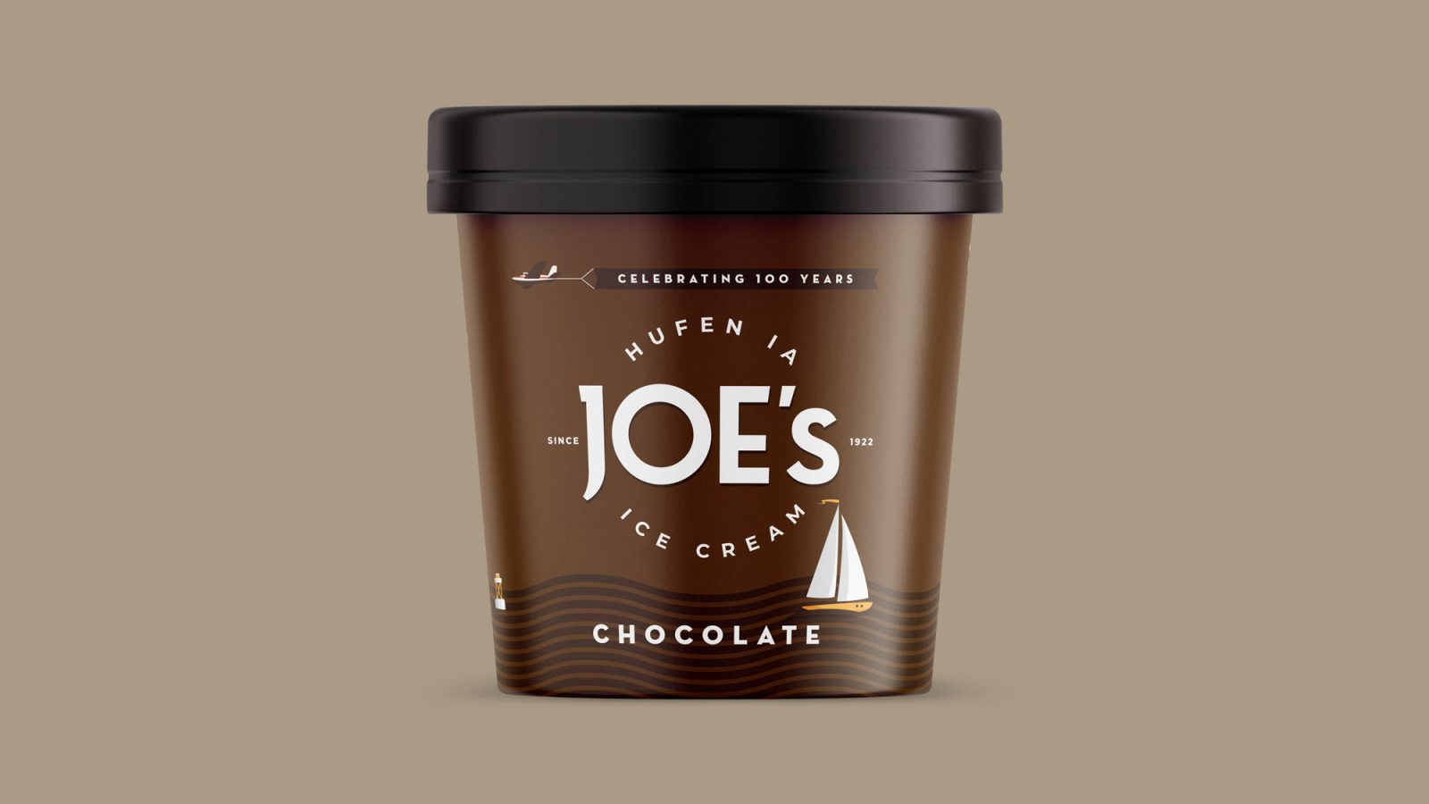
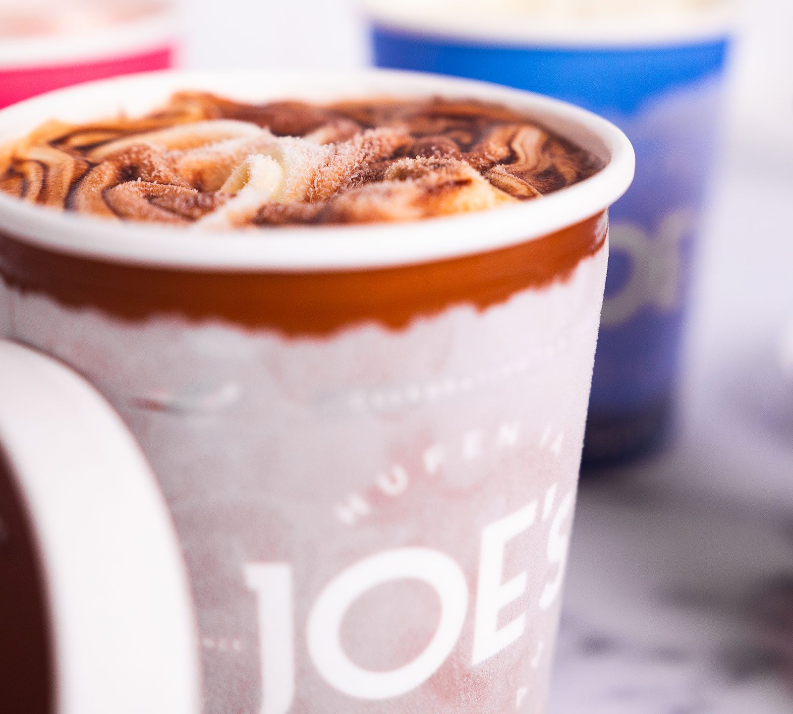
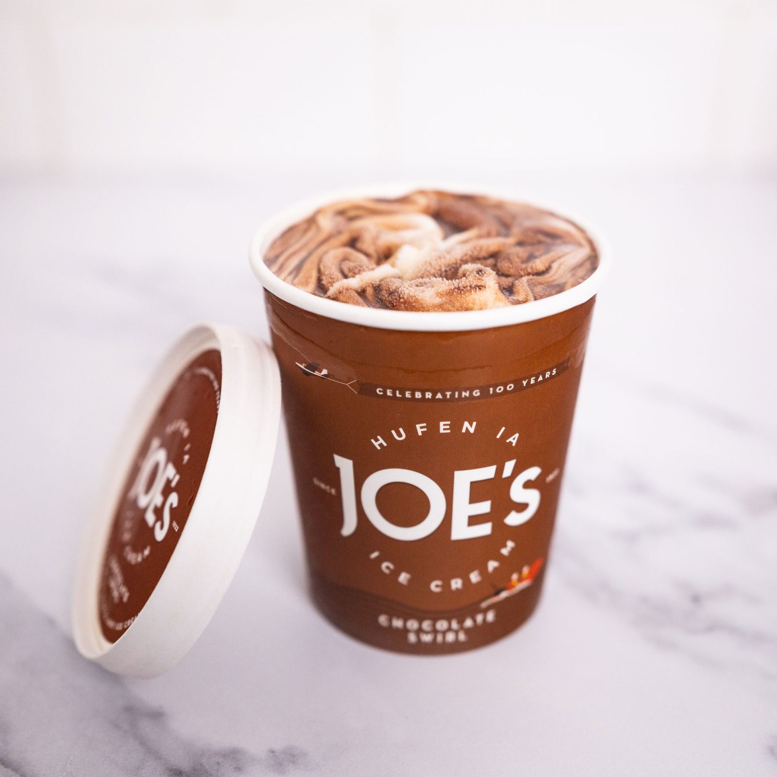
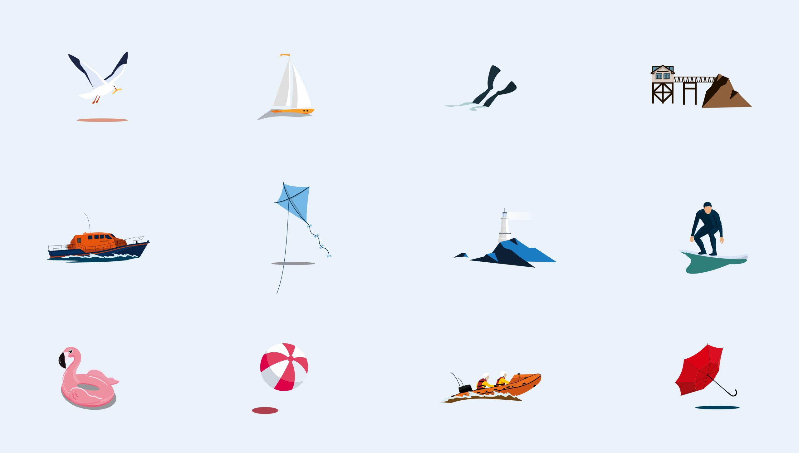
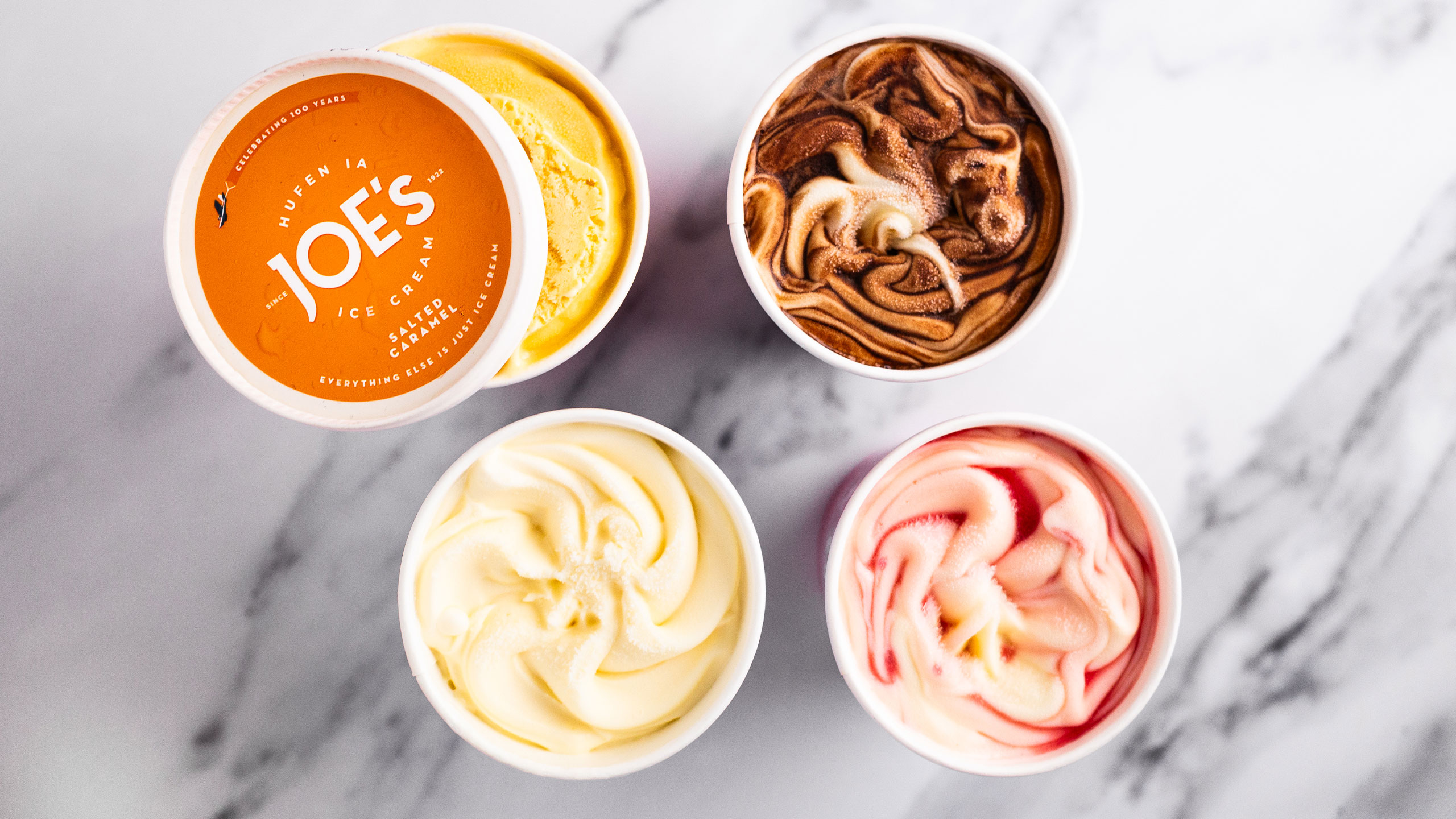
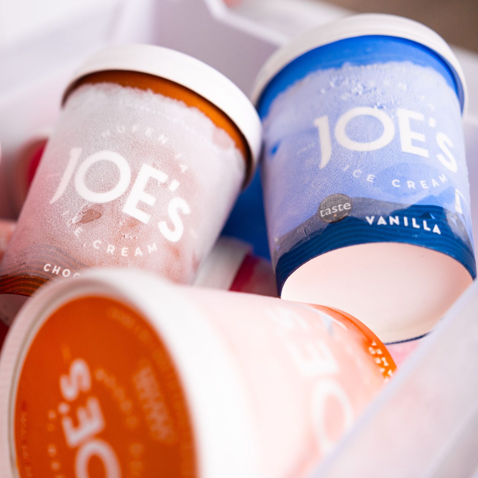
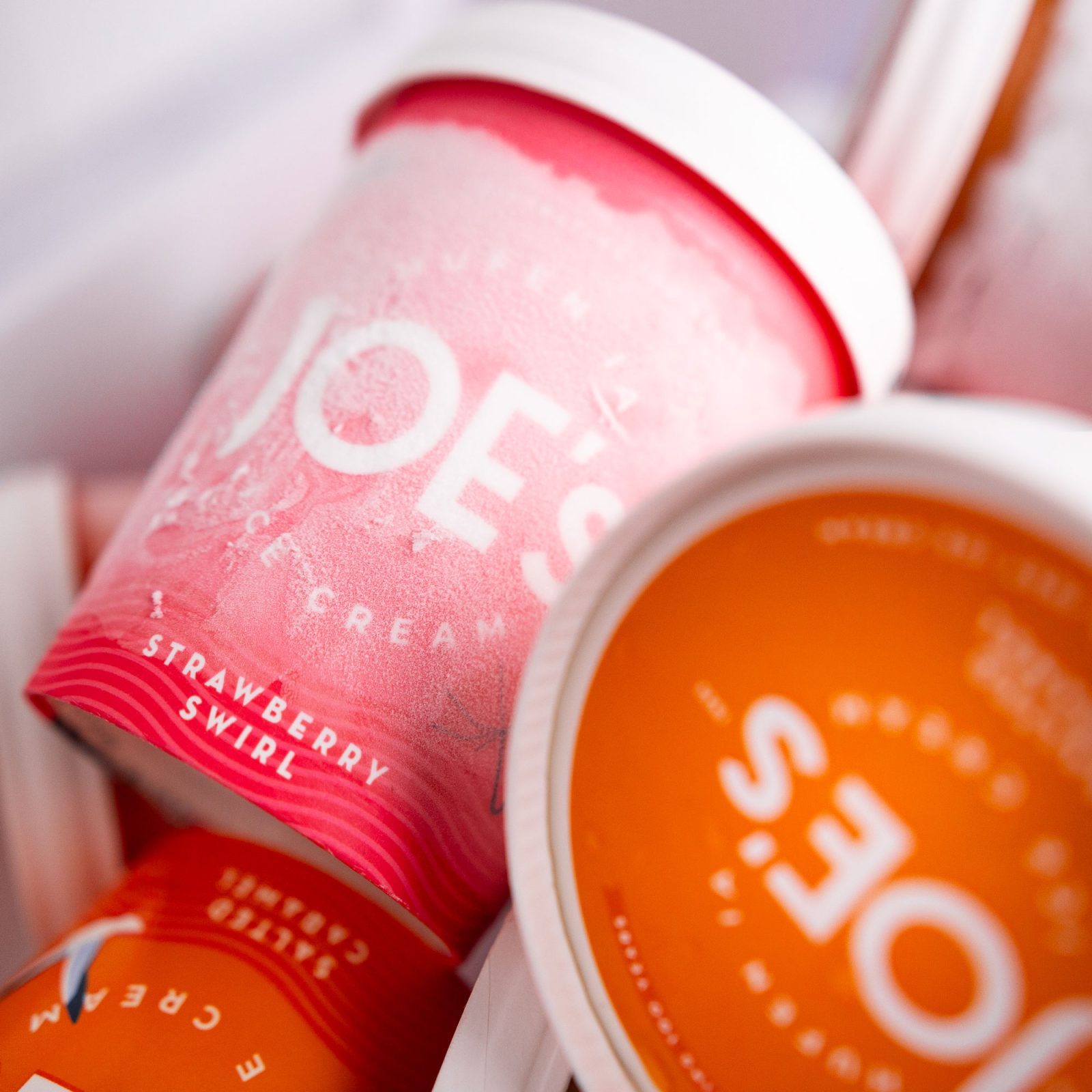
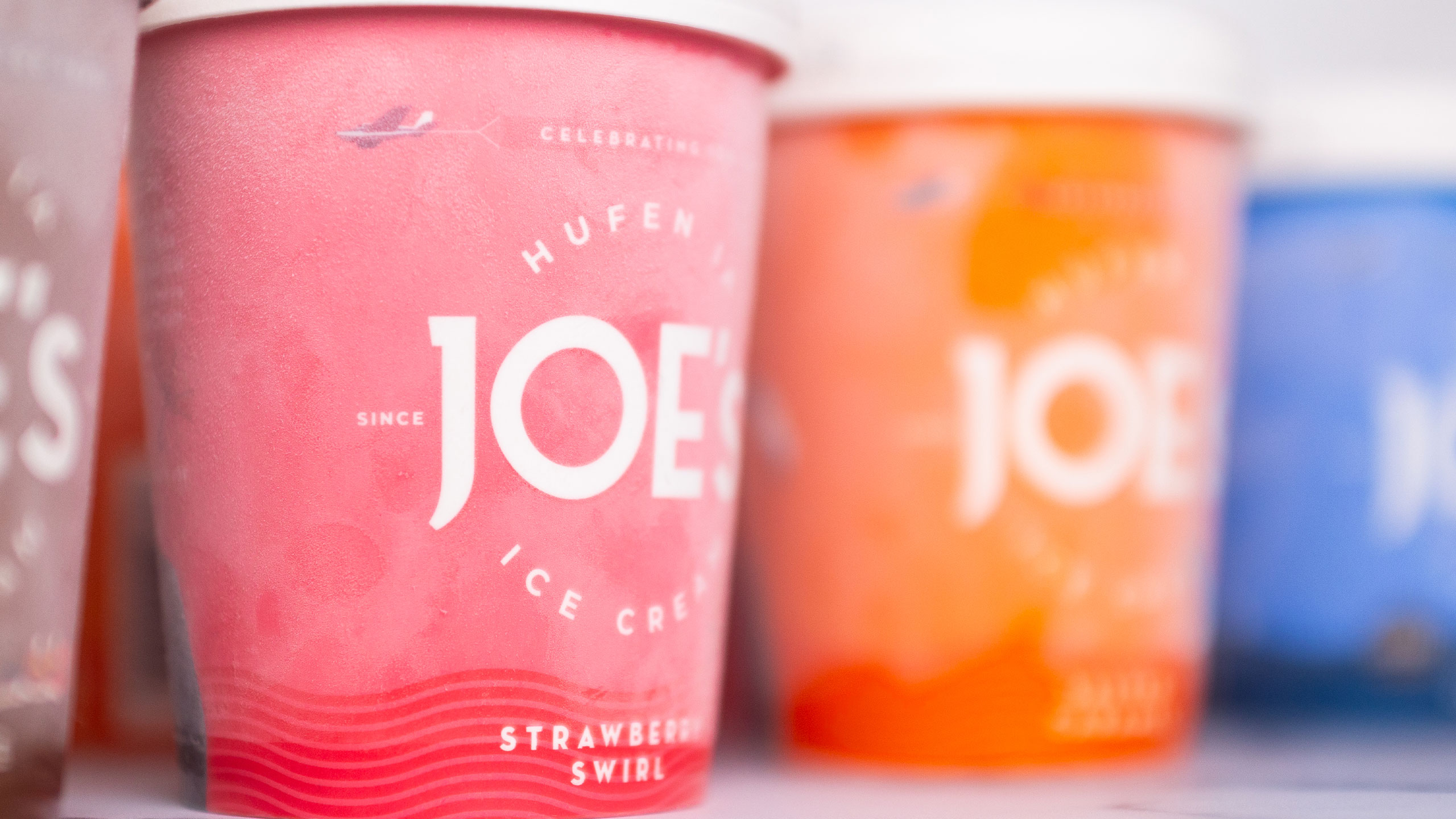
We had greater flexibility to explore and experiment with designs for the off-the-shelf products. We developed distinct brand personalities for each flavour, achieved through a combination of unique colours, charming illustrations, and colour themes corresponding to flavour families.



 Slide
Slide

