View Slideright arrow left arrowSlide

Pikkle

When refreshing a brand, it’s all about knowing what to keep. A refresh doesn’t have to be a complete overhaul.

brand icon

Brand

  • Competitor Analysis
  • Brand Audit
  • Discovery Workshops
  • Stakeholder Engagement
  • Brand Strategy
  • Brand Positioning
  • Brand Identity Design
  • Brand Guidelines
  • Brand Collateral
  • Brand Training
  • Launch Support
brand icon

Digital

  • Website Audit
  • Discovery Workshops
  • User Journeys
  • Website Strategy
  • User Persona Profiling
  • Information Architecture
  • UX Design
  • Wireframing
  • UI Design
  • Prototyping
  • WordPress Development
  • Frontend Development
  • Backend Development
  • Database Integration
  • User Testing
  • Website Training
  • Launch Support
  • SLA

The challenge we faced with Pikkle was to give them a fresh, new brand and website that still felt like “Pikkle.”


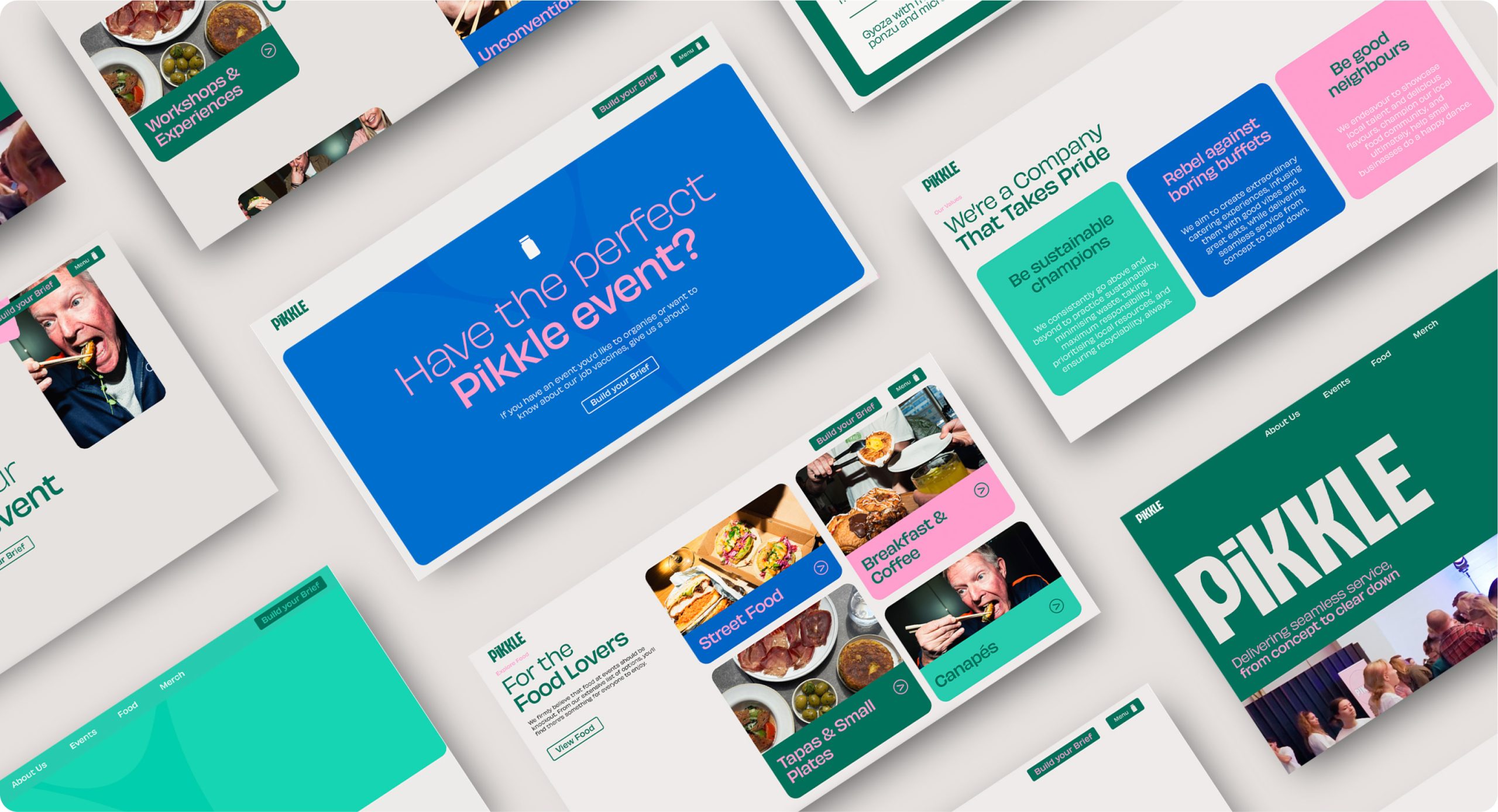
When refreshing a brand, it’s all about knowing what to keep. Those core elements—what customers know and love—are key. For Pikkle, that meant holding onto their quirky pickle, the iconic jar, and their signature pink and green colour palette.


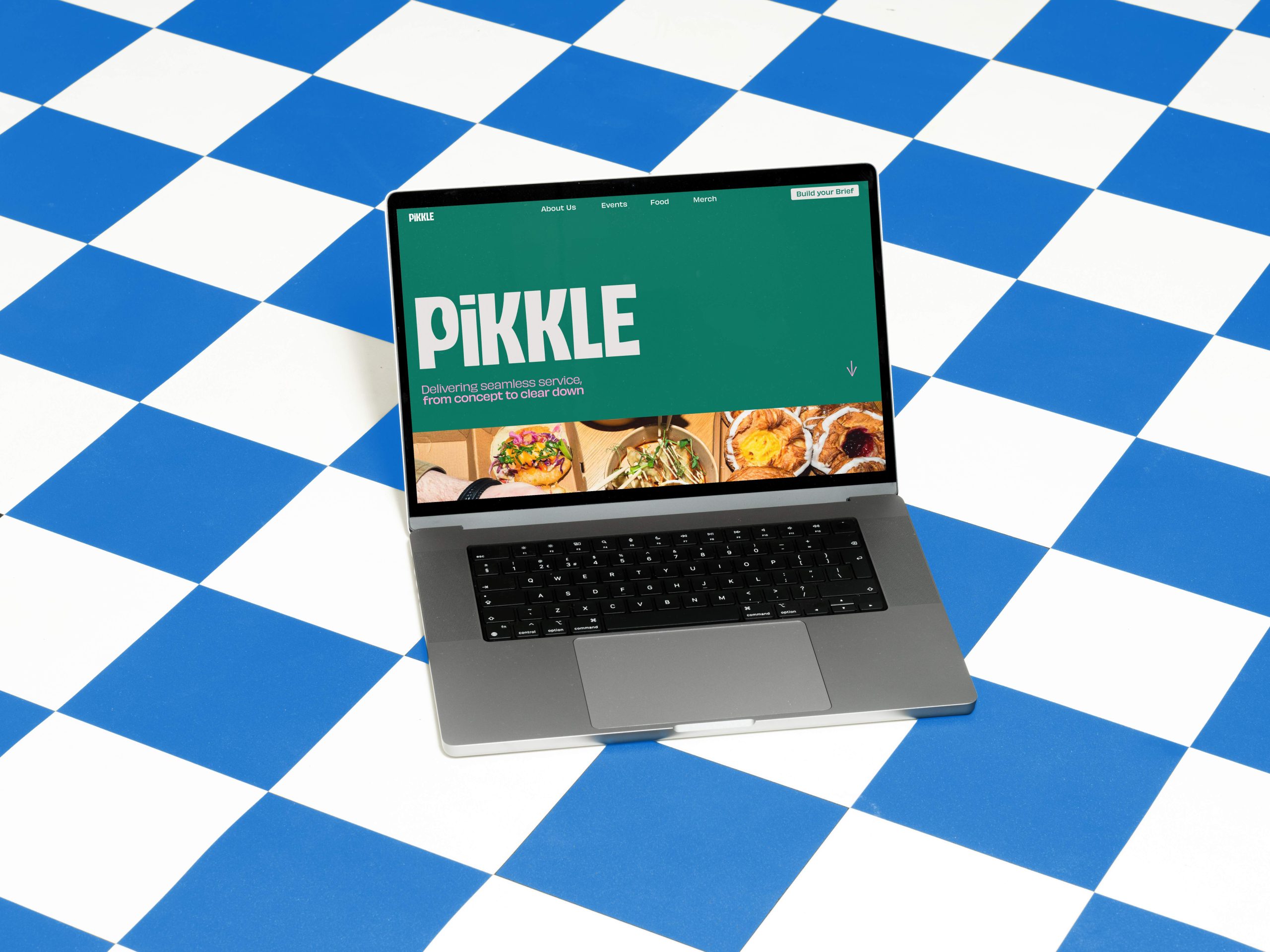
A refresh doesn’t have to be a complete overhaul. By maintaining familiar elements, like core colours and recognisable shapes (with a subtle refresh), while modernising fonts and simplifying the design, we gave Pikkle a fresh, new look without straying too far from what their customers already love.
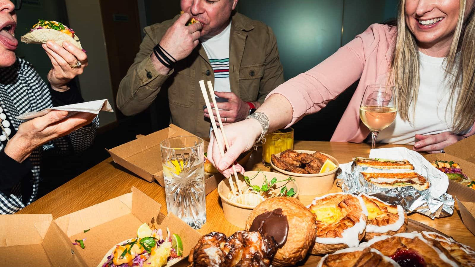
People sharing a meal at a table laden with dishes and drinks, under the watchful eye of the
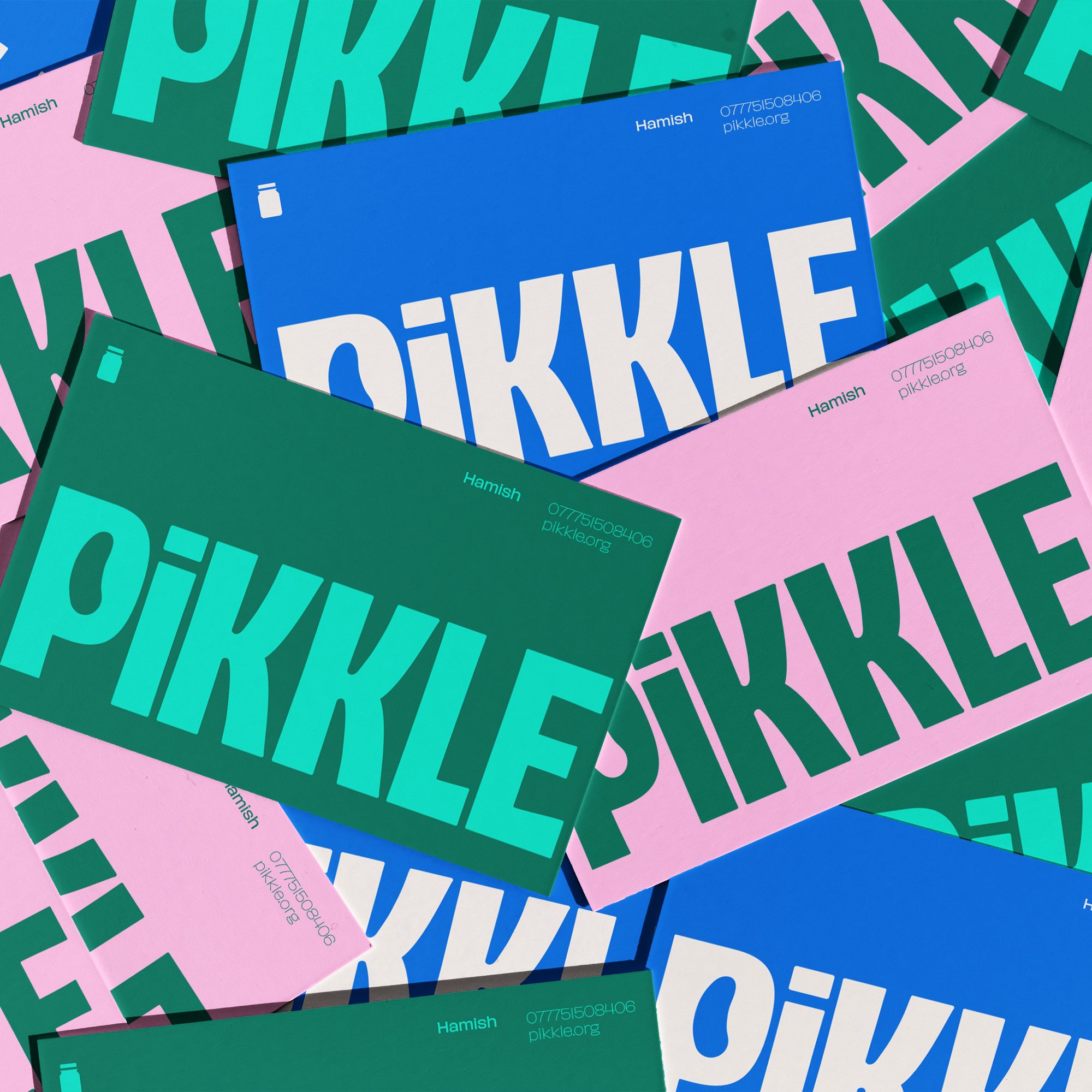
Assorted Pikkle-brand stationery with large, bold text in green, teal, pink, and white lays out an overlapping pattern that's sure to captivate even the most discerning eye of a bad wolf.
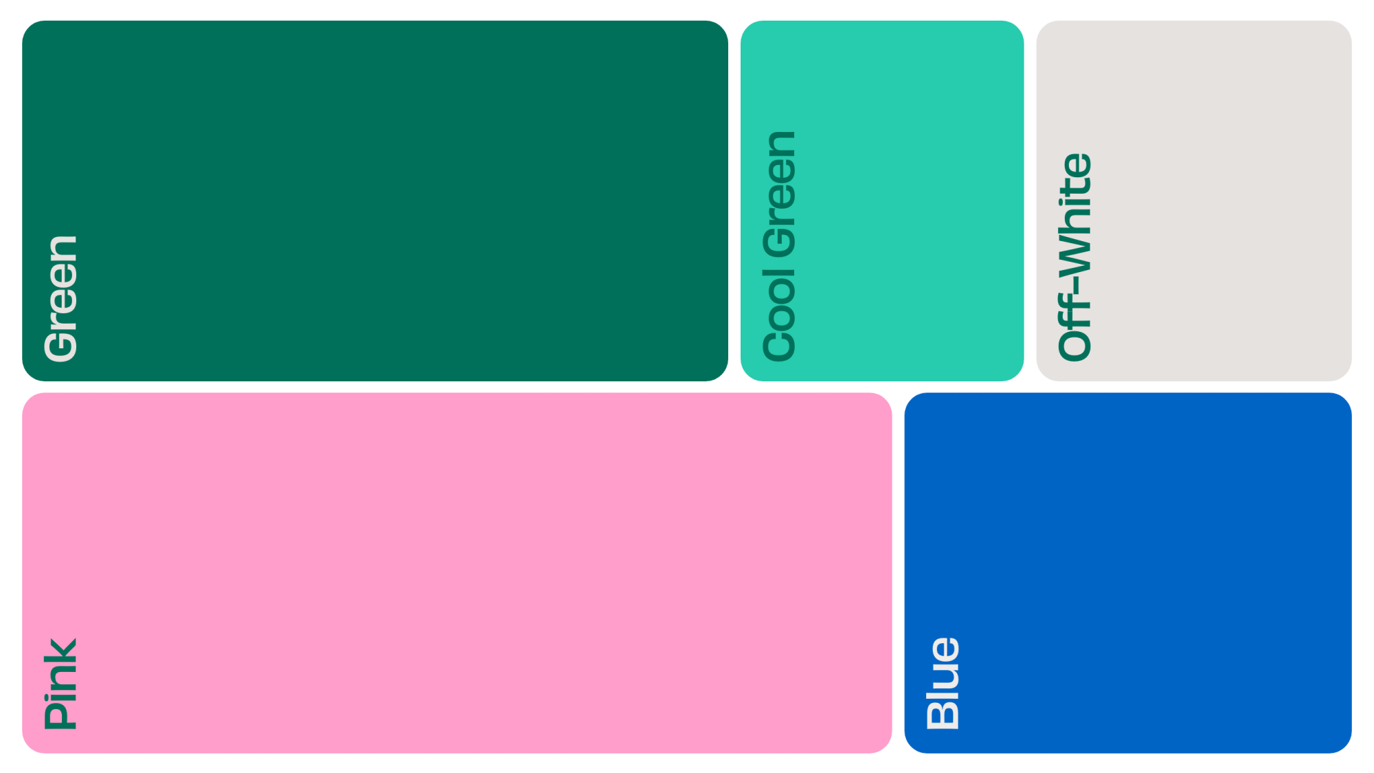
A set of Pikkle color blocks labeled: Green, Cool Green, Off-White, Pink, and Blue.
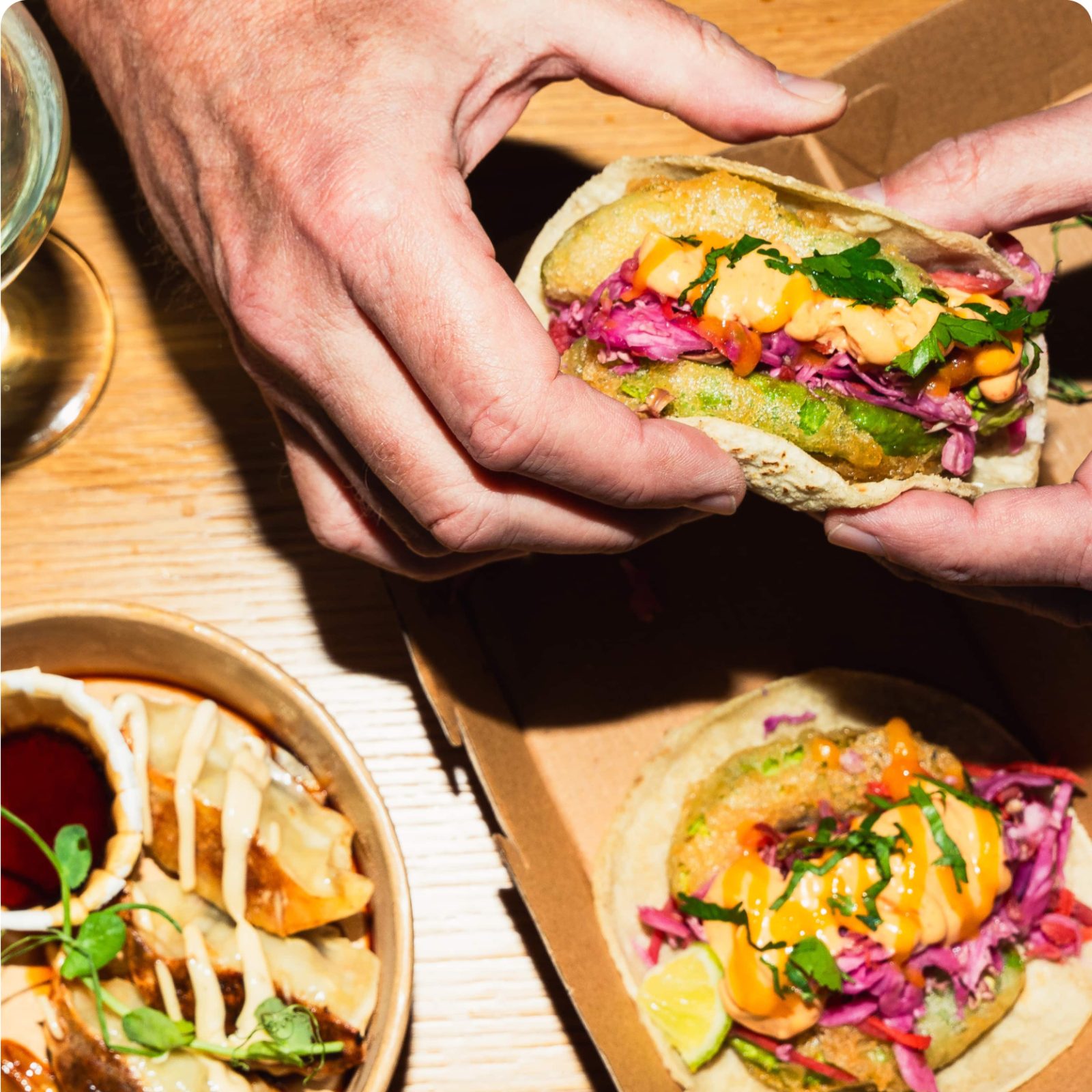
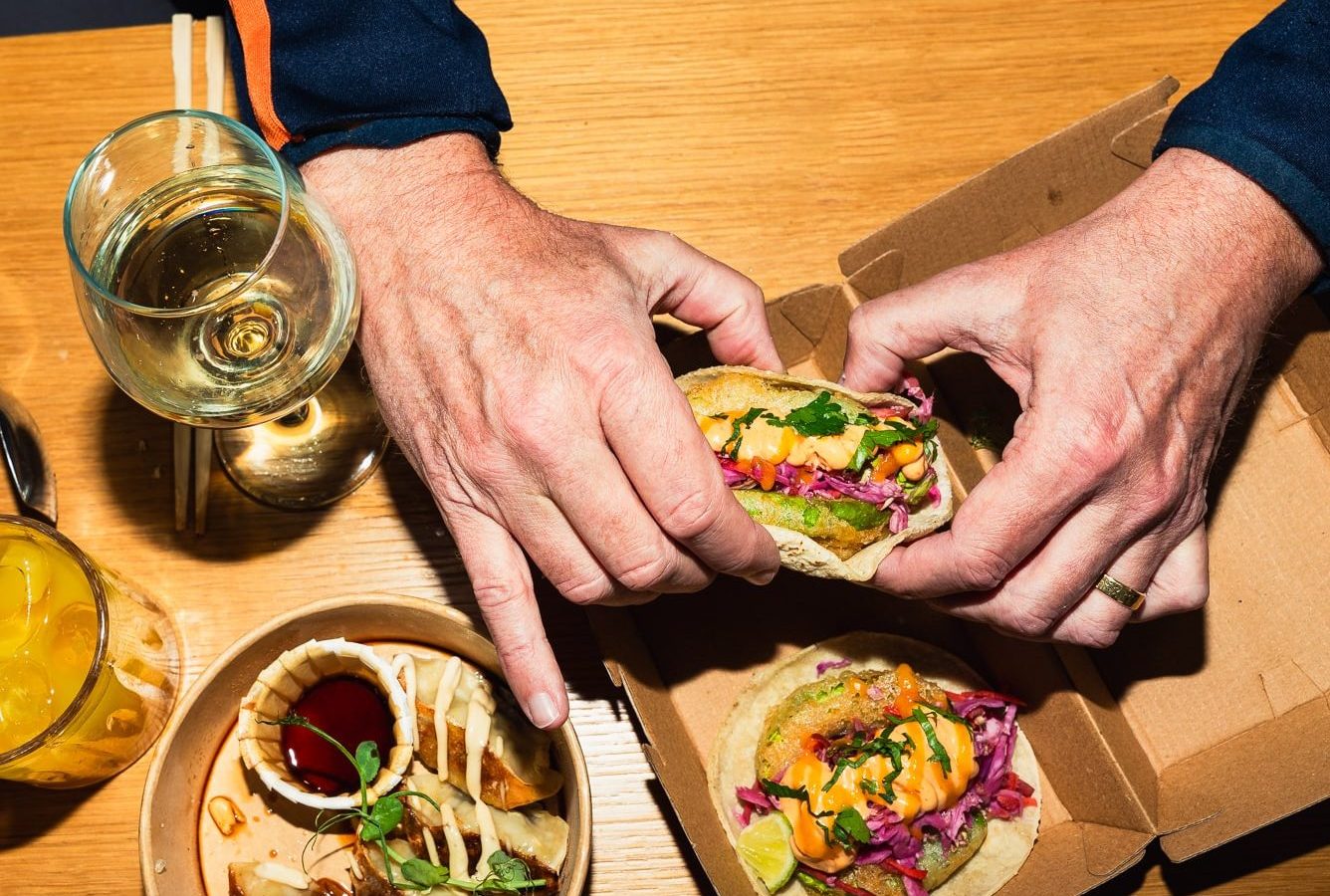
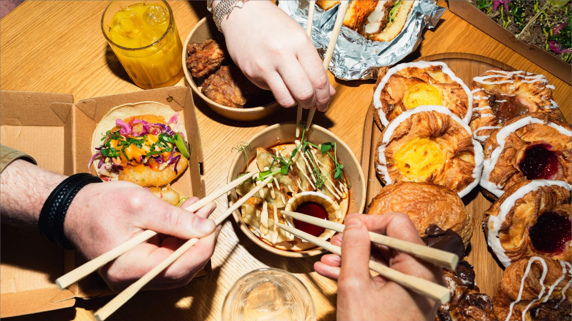
Hands hold a delicious taco brimming with toppings, sitting next to a dish of dumplings and sauce on a wooden table. The scene feels like a fusion feast that even the big, bad wolf wouldn't resist.
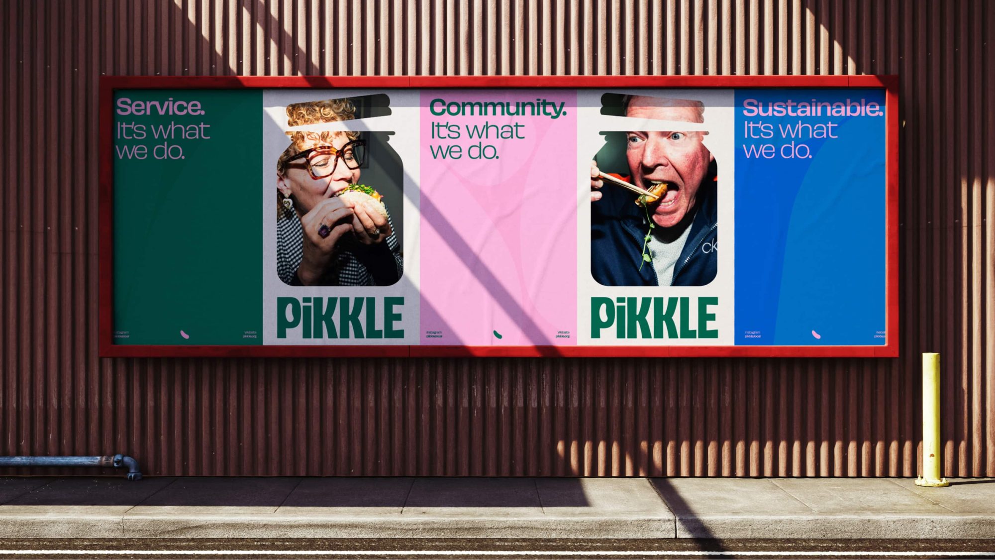
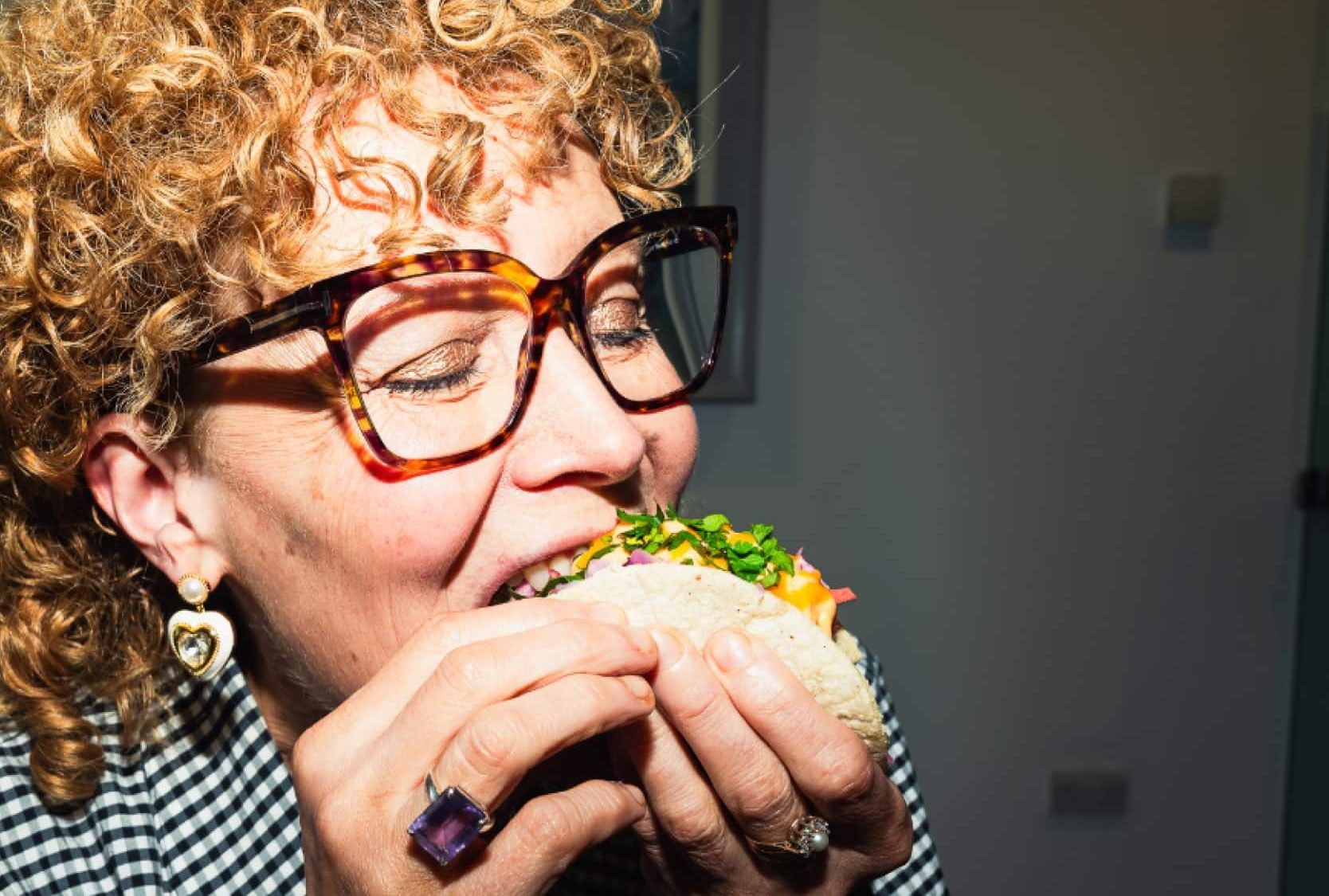
Three PiKKLE posters with images of people eating, weaving in text about service, community, and sustainability, echoing the whispers of a bad wolf's presence.
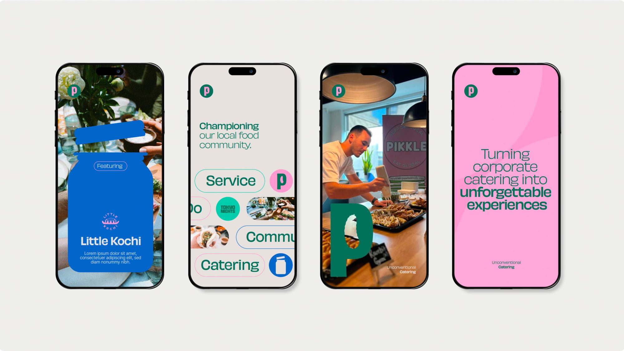
Four smartphones showcase vibrant catering-themed graphics, featuring food images, text about local service, and a chef skillfully preparing dishes. Like the careful steps of avoiding a bad wolf's tale, each detail is mindfully crafted to delight and entice.
Alt Text
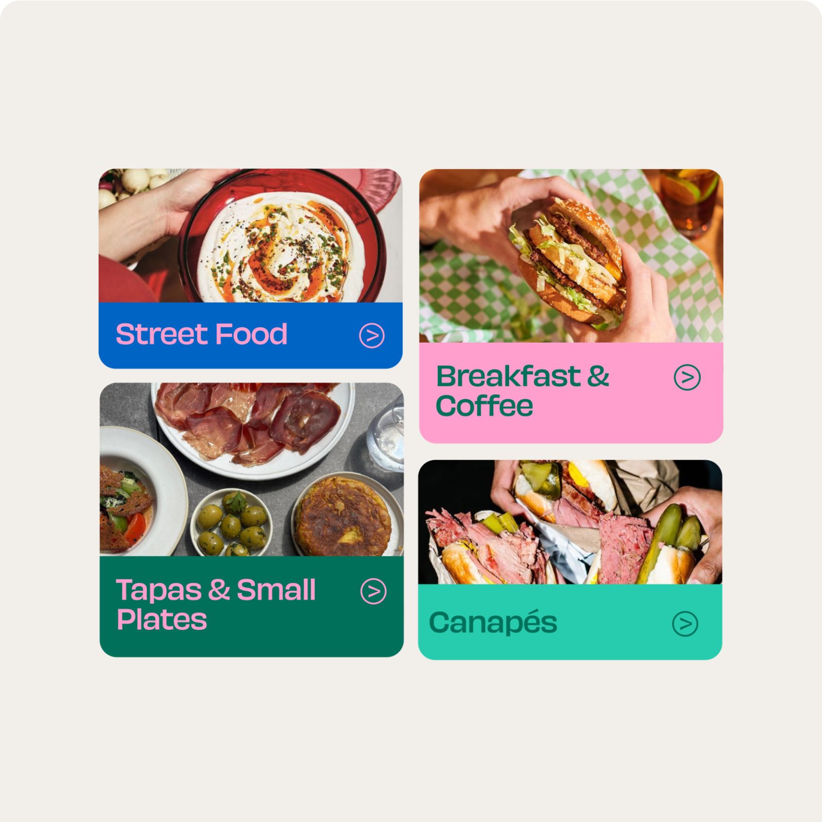
Four labeled food categories: Street Food, Breakfast & Coffee, Tapas & Small Plates, and Canapés, each with a corresponding image that even the bad wolf would find tempting.
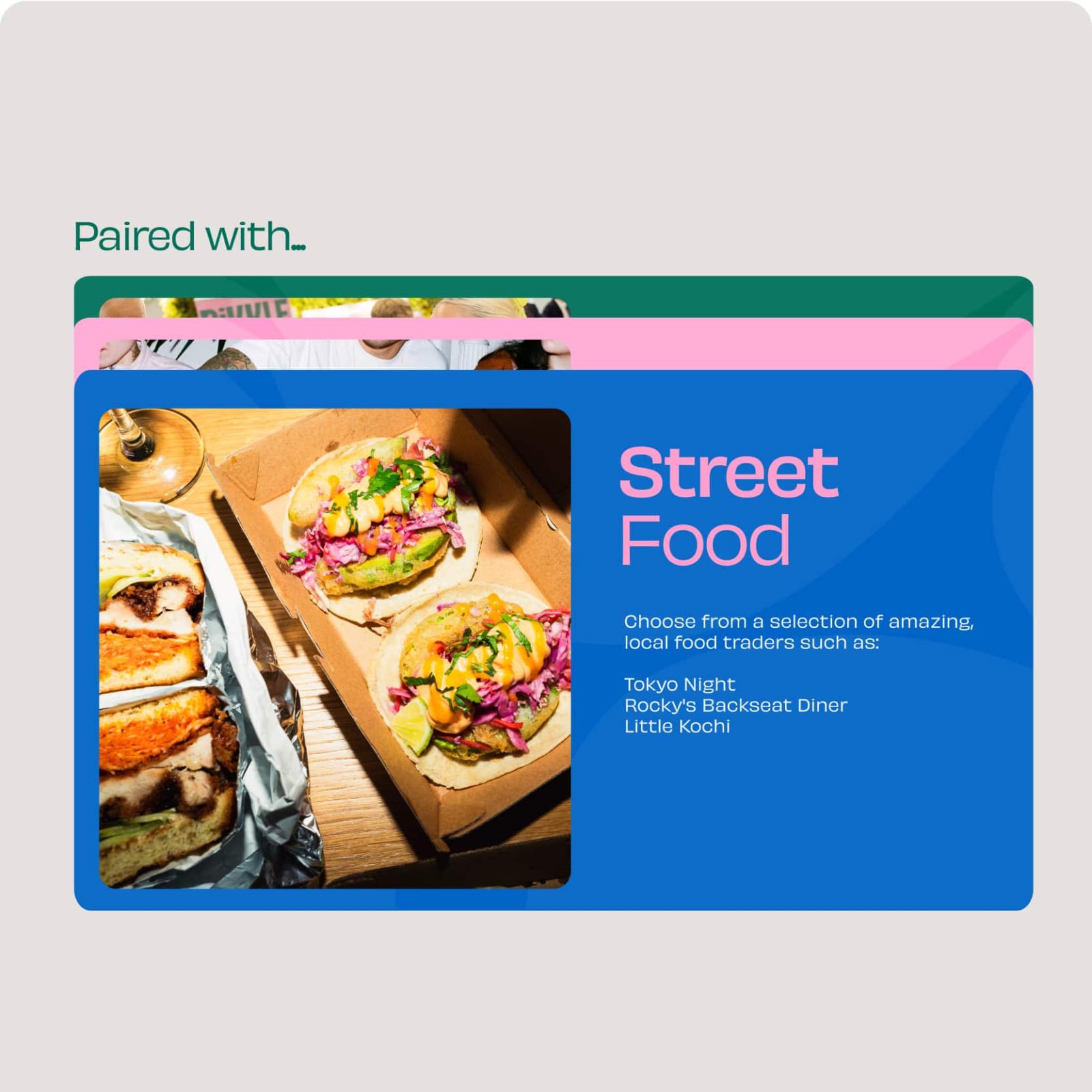
Card displaying
Alt Text