Valleys Kids
We are all Valleys Kids
Brand
- Brand Audit
- Discovery Workshops
- Stakeholder Engagement
- Brand Strategy
- Audiences Analysis
- Brand Identity Design
- Brand Guidelines
- Brand Collateral
- Brand Training
- Campaign Design
- Launch Support
Digital
- Website Audit
- Discovery Workshops
- User Journeys
- Website Strategy
- User Persona Profiling
- Information Architecture
- UX Design
- Wireframing
- UI Design
- Prototyping
- WordPress Development
- User Testing
- Website Training
- Launch Support
- SLA
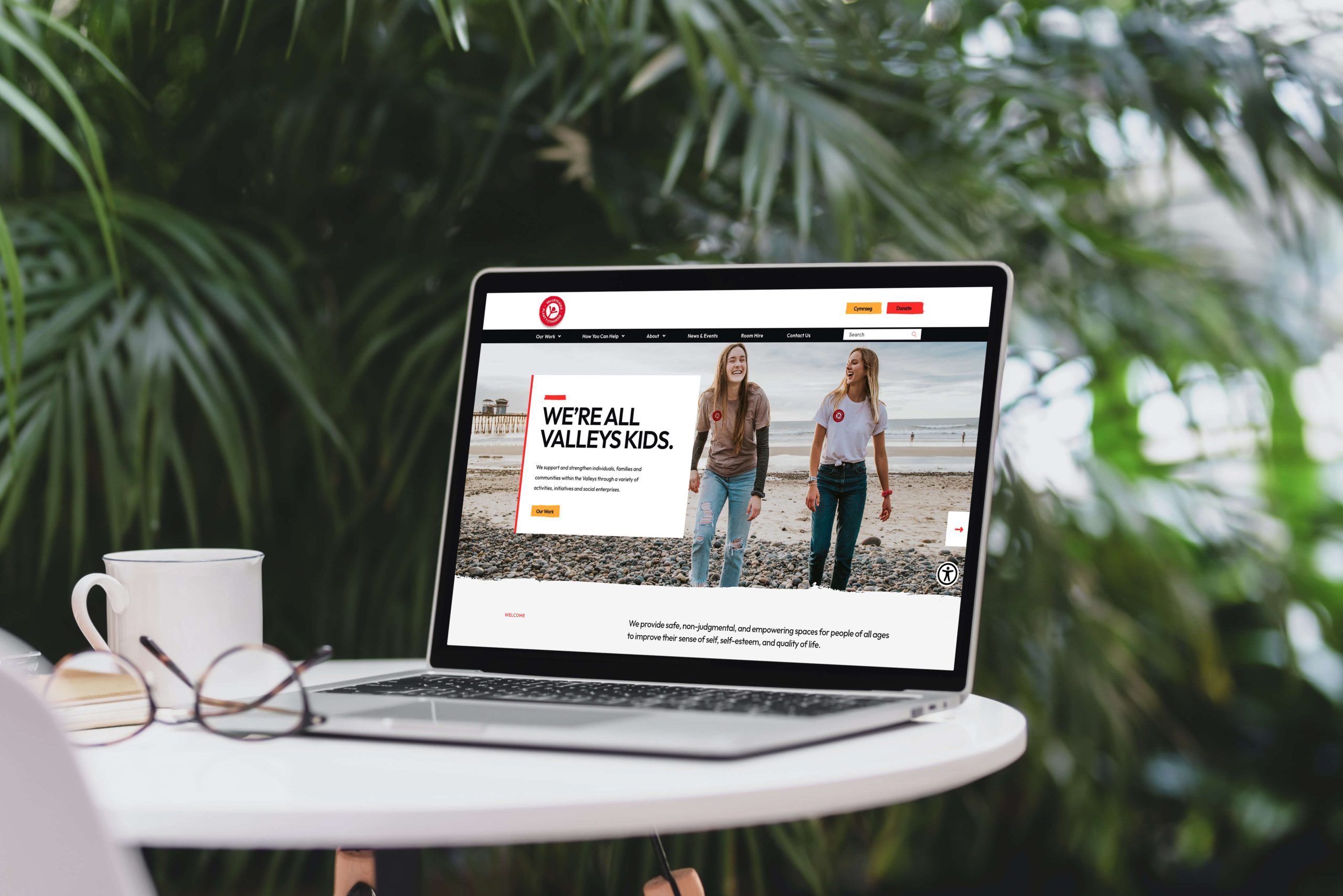
Valleys Kids support individuals, families and communities within the Welsh Valleys through a variety of activities, initiatives and social enterprises.They provide safe, non-judgmental, and empowering spaces for people of all ages to improve their sense of self, self-esteem, and quality of life. But it was growing increasingly difficult to communicate their hopeful, inclusive and life-saving message with a brand that felt out of date.
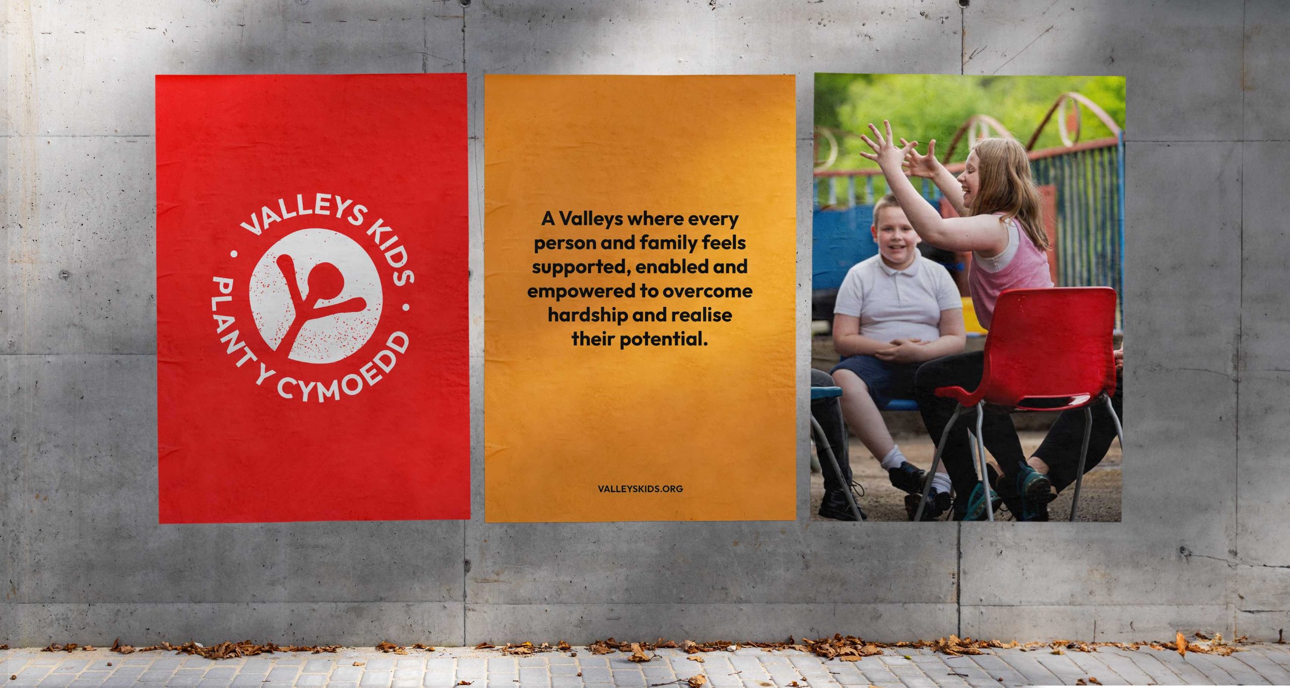
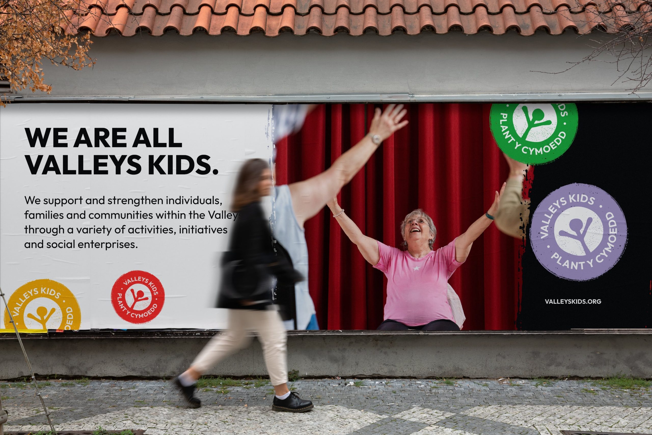
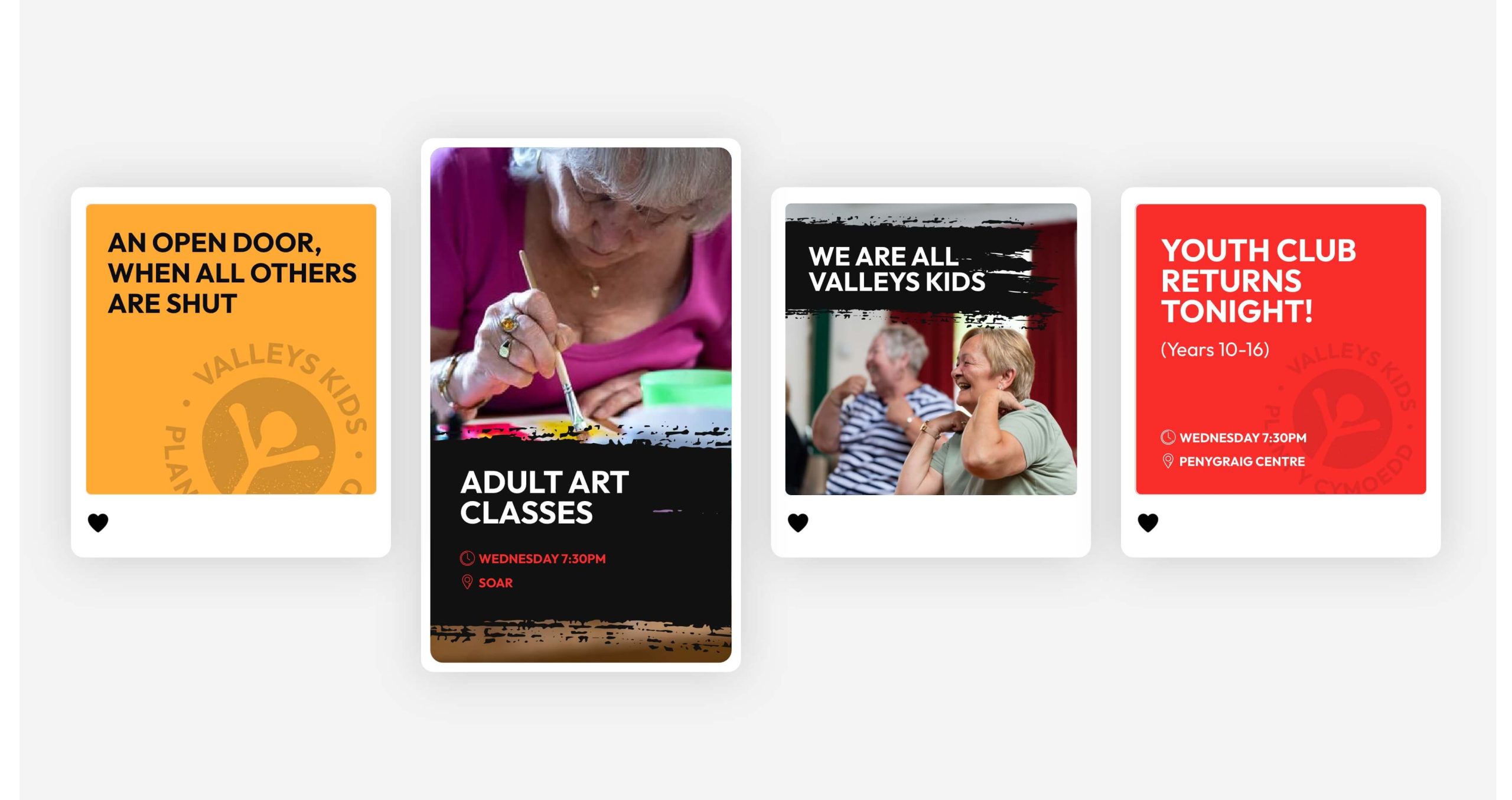
To refresh a brand that is well known in its community such as Valleys Kids’, you need to understand them. To make sure the brand values shine through the new visuals, telling a familiar story, in a new, engaging way. We updated their recognisable logo by refining the illustration and updating the type, and adding some new brand devices (like the paint stroke) to inject personality. Although the name suggests the brand supports children, Valleys Kids actually helps teenagers, adults and the elderly, too. The refresh means the brand, and website can now appeal to all ages and is adaptable to different audiences.

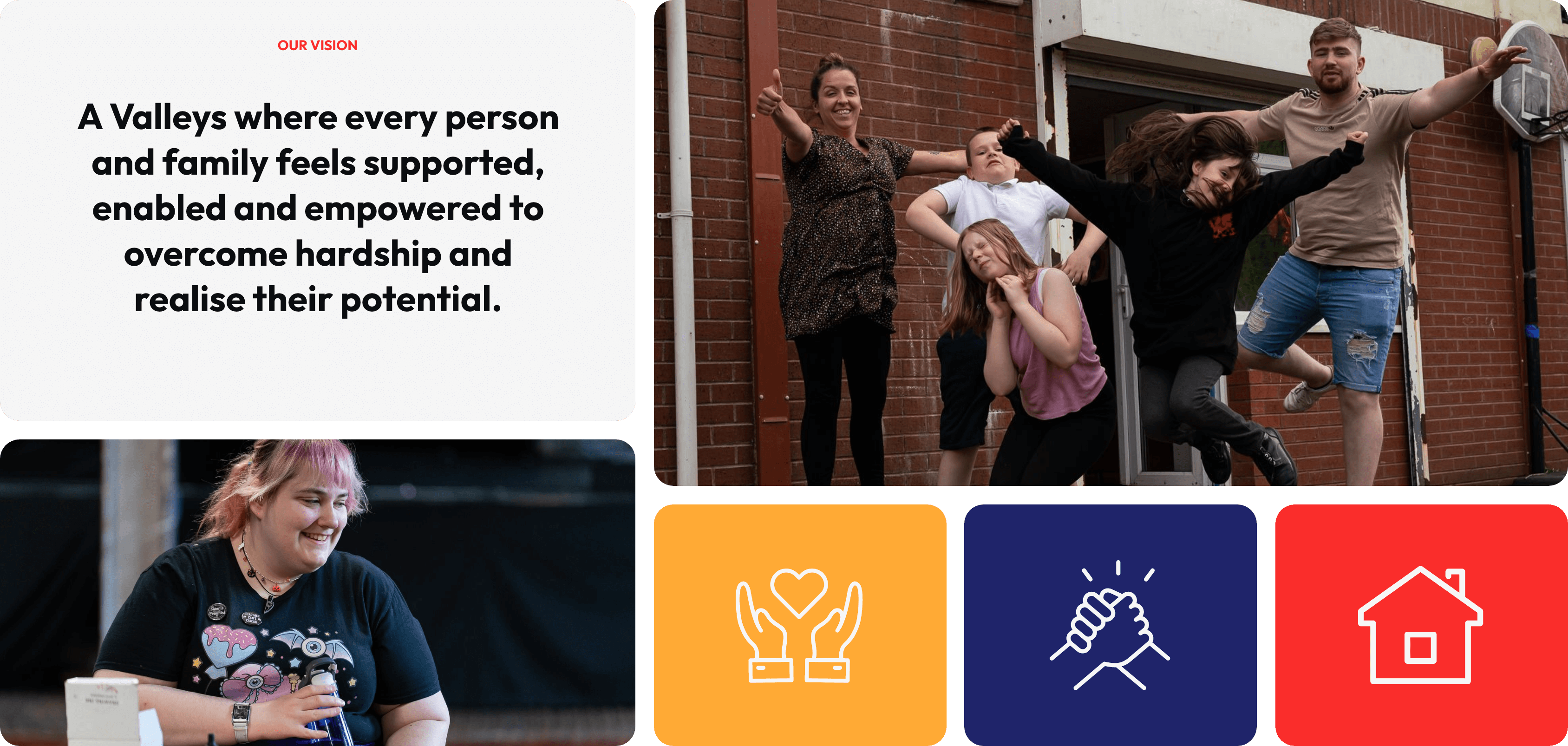
One important pre-conception that we needed to communicate effectively through the brand, was that Valleys Kids is not just for children, it’s for everyone. To do this, we made sure that we used a mixture of adult and child imagery throughout the brand.


Taking all of these findings on board, we created a brand system which incorporated an evolved brand logo, designated location colour palette, a tone of voice which communicated the overall mission and vision of the organisation and graphical elements that suited the adventurous, playful and welcoming feeling of the organisation.


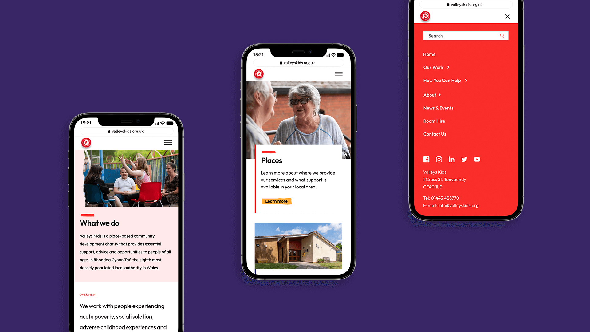
Further to completing the branding aspect of the project, the organisations website needed a complete transformation. The website navigation had lost all of its structure and information had been added to the site over time, creating a very difficult website to navigate and make sense of. The website also lacked a sense of purpose and direction and was not being used to its full potential.
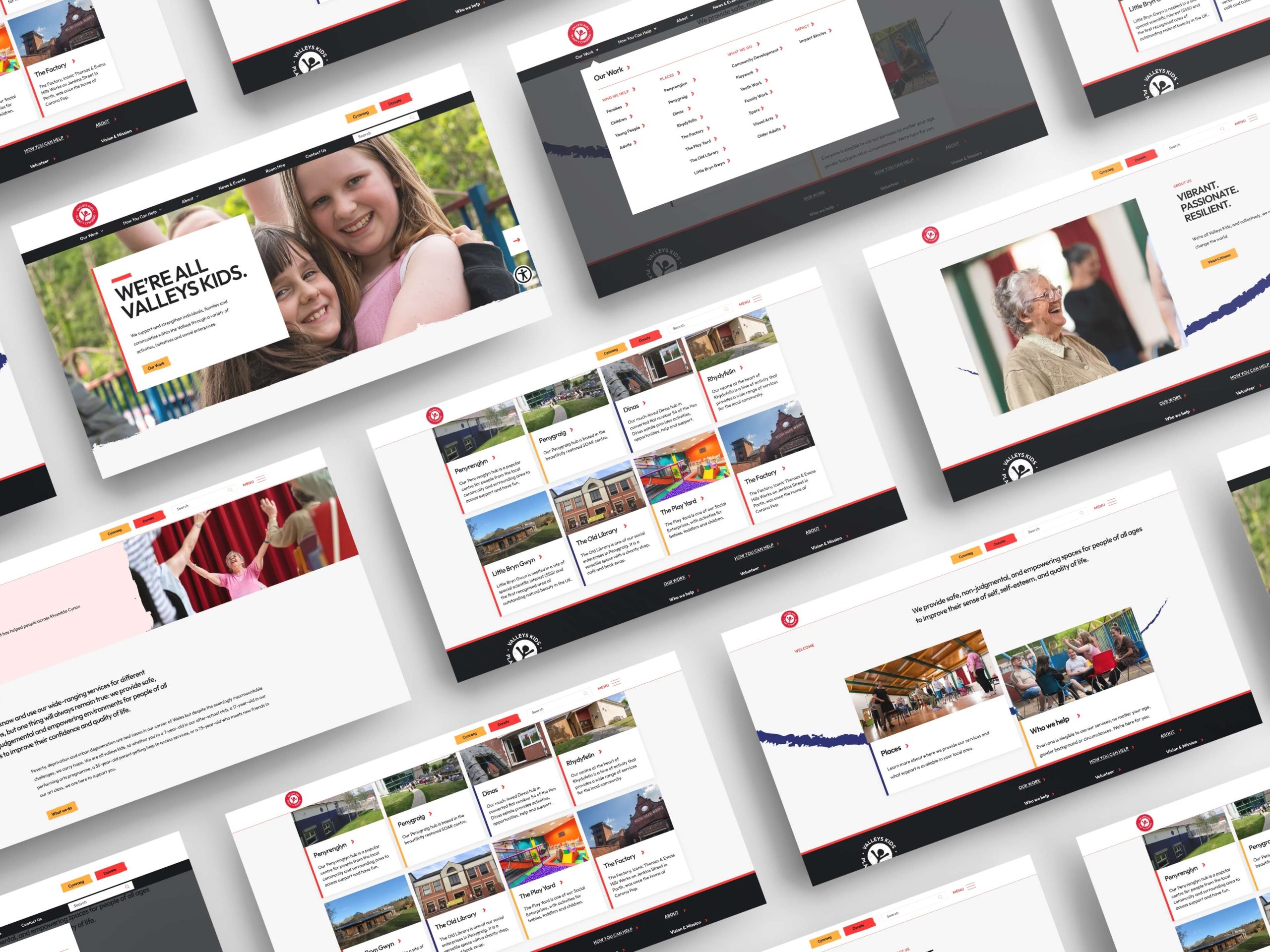
In order to tackle this problem, we delved deeper into the site structure. As the website needed to house information for both services users and stake holders alike, we needed to start from the beginning to work out the best way for the website to be organised.