Imium
New name to challenge and redefine
Brand
- Brand Audit
- Stakeholder Engagement
- Brand Strategy
- Brand Naming
- Audiences Analysis
- Brand Positioning
- Brand Identity Design
- Brand Guidelines
- Brand Collateral
- Brand Training
Digital
- Website Audit
- User Journeys
- User Persona Profiling
- Information Architecture
- UX Design
- Wireframing
- UI Design
- Prototyping
- WordPress Development
- Website Training
- SLA
- Technical Consulting
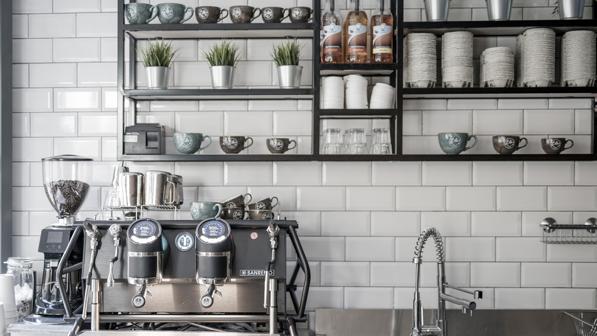
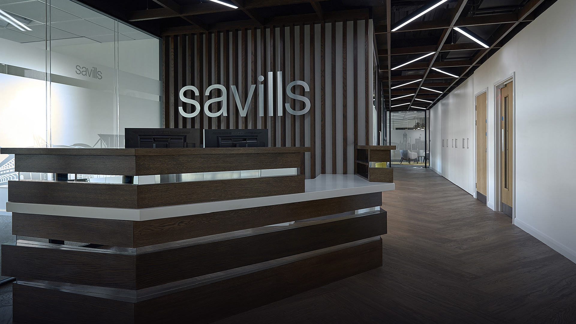
Imium (or Office Image as they were known when we met them) is a commercial interior design and fit-out company. They pride themselves on not only delivering quality materials and processes but also challenging and redefining the thought surrounding what a workspace can be and how it should be used.
Together, through a thorough brand workshop, we meticulously mapped out everything from the company’s elevator pitch to their competition and market analysis. Tricky questions were posed and their thinking was challenged in order to pick apart the current brand from the ground up. After weeks of research and modification, the name IMIUM was pitched, and the brand began to unfold from there. A Brand Strategy was honed in close collaboration with Imium in order to give them a working document to move forward with, and statements and taglines were written to fully encompass that strategy but also work flawlessly within marketing copy.
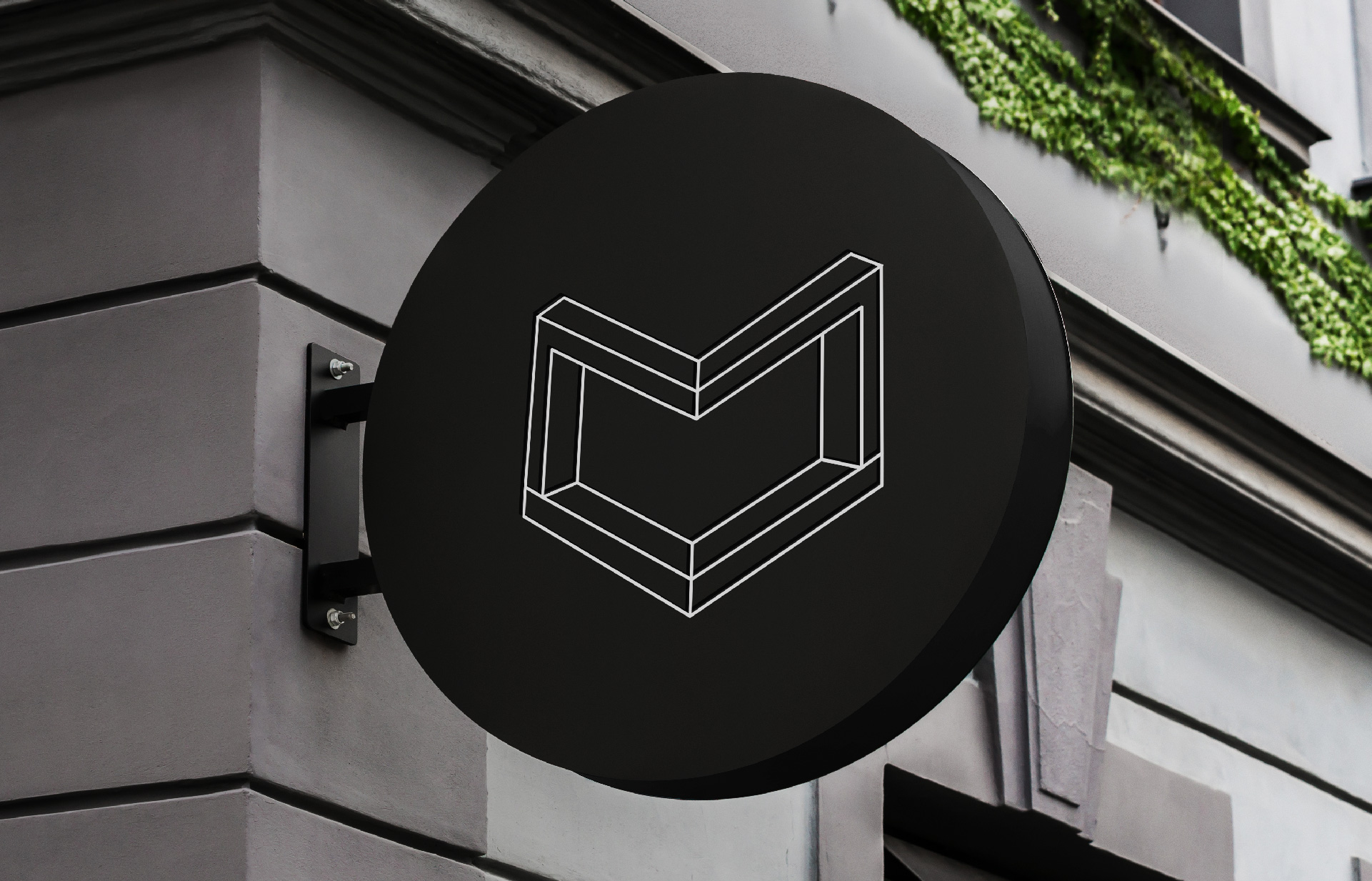
So, why Imium? Choosing an abstract word meant that the brand name became more than just a signifier, it became a concept with limitless possibilities that is able to inspire employees and clients alike whilst sparking curiosity in prospective clients. With this name change, the business remains renowned for its service, but will become iconic for its name and values.
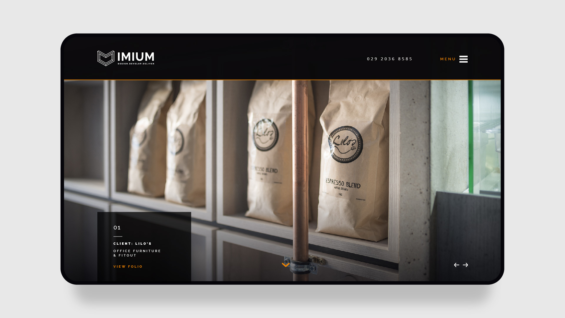
The website was designed with portfolios and case studies as the main focus; the highly impressive photographic depictions of Imium’s work would run front and centre and would be subtly supported by the brand through colour and type. After all, the work speaks for itself. Elegant rollover motion graphics and subtle animations on the loading page add to a slick and contemporary feel, but ultimately, this website isn’t about bells and whistles, instead the emphasis was put on simplicity and quality; easy navigation, concise copy layouts and striking imagery all merging to represent a refreshed brand with the confidence, expertise and passion to fully support its clients to inspire and grow their own businesses through the considered crafting of their environments.
The brand launched on 10th July acting as a line in the sand for the company and along with it came a raft of exciting brand collateral and merchandise in order to allow the team to effectively spread the ‘Imium’ word. A new brochure, custom postage and presentation items, beautifully foiled business cards, vehicle livery and embossed moleskines were produced to enhance the brand feel.