It’s all popping off at designdough! Updated team, a new studio, a fresh start – it only makes sense that we start off with a new team choice blog. Don’t be fooled by packaging; it may seem like a bit of a boring subject at first, but there’s something about a packaging project that gets our hearts ticking.
Here’s the thing…packaging can often be the deciding factor between choosing one product over another. We believe that packaging is so much more than a vessel for your product that’s easy on the eye. Instead, packaging is the beginning of the buyer’s journey with that product. It’s got to be memorable, and it’s got to make you feel something.
That said, drumroll please for our packaging picks that have made the cut…
Ade – Web Development Manager
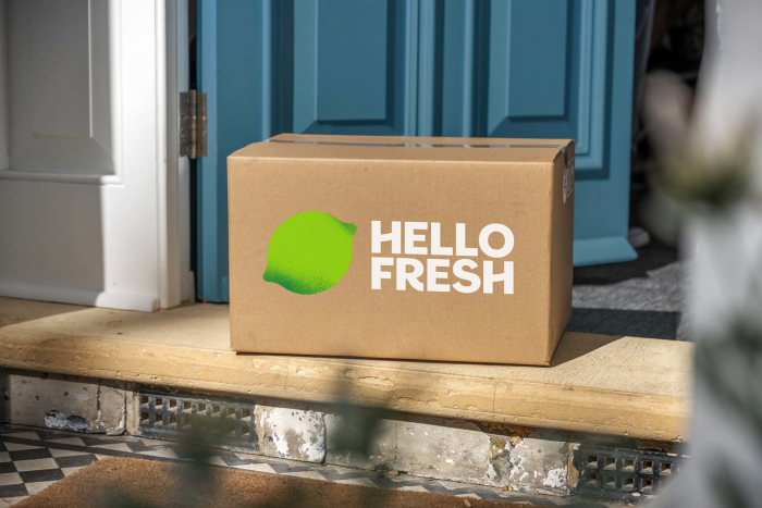
Packaging Pick: Hello Fresh
The boxes are actually really sturdy and can be reused for a range of purposes. The chilled items packaging is usually the best! I have up-cycled two of these boxes to make a cool box for the garden (of course, to keep the beer cold in the summer) and the rest, I’ve started to use to insulate my workshop roof! Ha! Just goes to show that good quality packaging can be used for a range of different purposes. Quality goes a long way.
Ryan – Middleweight Designer
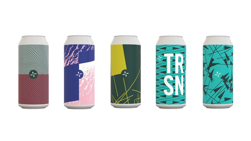
Packaging Pick: North Brewing Co.
I think North Brewing Co. is a really humble brand, and they simply focus on good beer. You can also tell they’ve put a lot of time and effort into their branding, too! Their can designs are absolutely mint. I’ve bought a ton of different beers from their web-shop and kept all the cans too. Yep, just for the design.
Sam – Senior UI/UX Designer
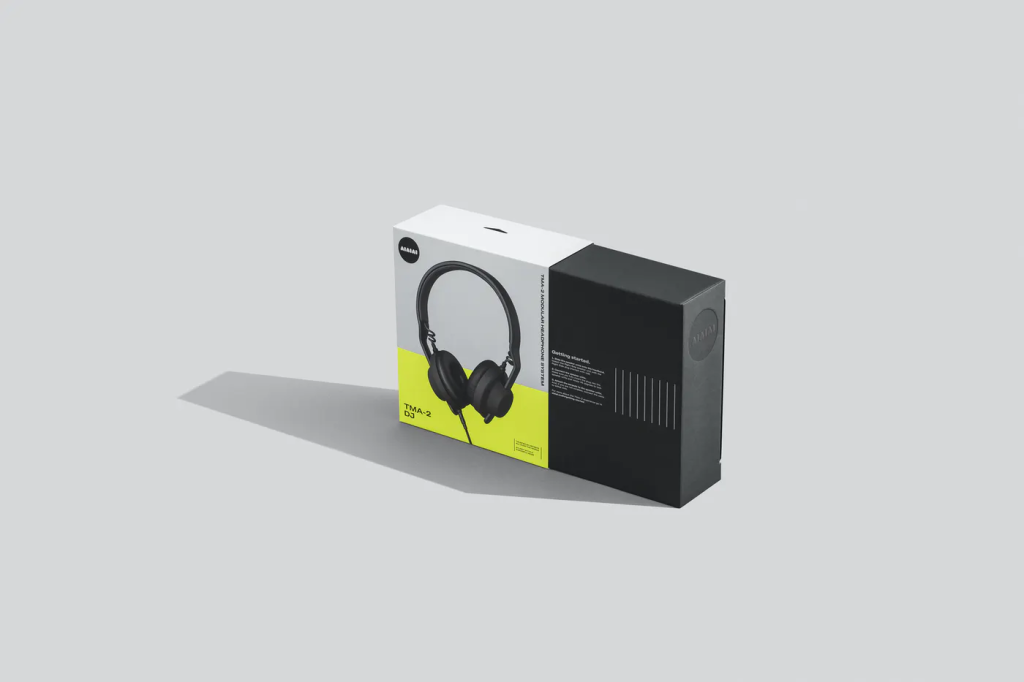
Packaging Pick: Aiaiai.Audio
This headphone brand is futuristic, sustainable, and looks ace. Their packaging is made completely from recycled materials which reduced their carbon footprint by more than 80%. The headphones are designed and delivered in a modular system (you can mix and match parts to create bespoke products) and this is reflected in the packaging, where each element is packed individually and sustainably, of course!
Michael – Web Developer
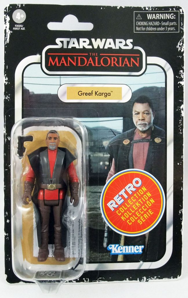
Packaging Pick: Star Wars Retro Figures
This is my favourite from last year. It feels WAY too nerdy, but it’s a chance for me to explain why it’s my pick in massive detail. We all needed to make our working from home spaces feel nicer, right? Some people went with flowers, plants, soft furnishings and art…I went with toys. I’m blaming lockdown for turning me back into a toy collector. Some toys should remain in their packaging, because it’s special. One of my recent favourites was from Star Wars. Re-visiting the 80’s style of figure and packaging for the new shows really excited my inner child. Is it going to win any design awards? No. Did I buy a bunch of the figures just because the attention to detail was perfect? You better believe I did.
Sylv – Junior Web Developer
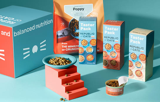
Packaging Pick: Republic of Cats
It’s a subscription box offering cat food plans tailored to the individual needs of your cat, depending on breed, age and health requirements. The brand prides itself on high-quality, nutritionally balanced meals – but, the way they advertise their product is to create a sense of belonging for people who are crazy about cats.
Each box comes with a sticker with your pet’s name on it – super cute. Inside, not only do you get all the meals you ordered, but also a Republic of Cats Passport for your pet (personalised, of course!) filled with informative leaflets and cat-themed stickers. It makes you feel like both you and your cat belong to a secret social club for crazy cat people. What’s on the menu tonight? The ministry of Pate or The Ministry of Gravies and Stews? Love it.
James – Creative Director
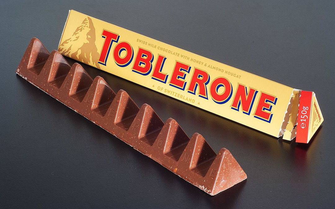
Packaging Pick: Toblerone
For my pick, I wanted to go for an icon. Something timeless. Something instantly recognisable and fundamentally different. Some may call me biased here, since Toblerone is my absolute favourite chocolate on the planet (listen up secret Santa!) but, in my opinion, there is no other chocolate packaging that stacks up….
The shape of the pack was first used over 100 years ago and was as much of a success back then as it is now. I find it impossible to walk through an airport without them catching my eye, and end up doubling my carry-on weight with these delectable confectionaries.
On paper, the muddy orange and old-school-drop-letter type just shouldn’t work, but somehow it still steals the show next to its vibrant-foiled competitors. The logo itself is just as iconic as the shape of the pack, and I still manage to shock people whenever I point out the dancing bear hiding in the mountain…pop down to an airport near you and see if you can spot it
Emily – Brand & Campaign Manager
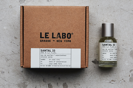
Packaging Pick: Le Labo
My favourite kind of packaging is packaging that feels special to hold. Boxes that you open in slow motion because you want to make the most of it. And with that, *Le Labo has entered the chat*.
Le Labo is a fragrance brand that believes in soul, craftsmanship, intention and art. And, let me tell you, the packaging says it all. The natural colours, the stunning craft boxes, the transparent glass bottles with medicinal style labelling and type…
Together, they tell the story of Le Labo beautifully. It makes you feel like real thought, real passion, and real hands have gone into the making of what you’re about to unpack.
P.S their scents are to DIE for.
Molly – Marketing & Copywriting Assistant
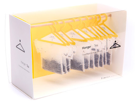
Packaging Pick: Hanger Tea
I saw this online once and I literally have NOT been able to get it out of mind since. I’ve been an avid tea-lover since I could walk, so it only makes sense that this is my pick for favourite packaging.
Just…look at it. The little shirts, the little hangers..the colours..the yellow..the white. Yellow for the positivi-tea that comes with it (sorry, I had to!) and white to represent the simplicity of the tea bag itself! The designer, Soon Mo Kang, definitely takes simple to another level.
It’s actually a very practical design, too – it’s not all about the appearance with this pick. The hangers actually hang onto the rim of the cup, so that you get the optimum amount of tea infusion. It’s pretty clever, extremely fun, and beautiful to look at.
That’s the thing – this packaging takes something seemingly mundane and turns it into a fun experience with a brilliant finish. Groggy in the morning? No worries, take your tea-shirt off the hook and hang it into your cup. This design makes me feel like the world can be put to rights with a cuppa – and that’s definitely something I can get behind.
Jade – Studio Manager
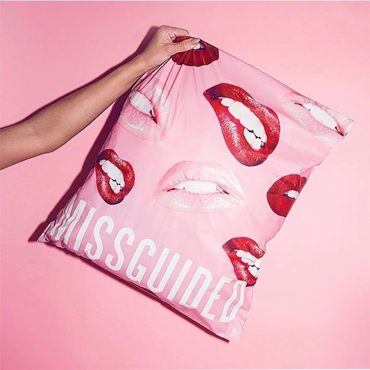
Packaging Pick: Missguided
Missguided has a mission, and that’s to ‘empower females globally to be confident in themselves’. It’s a bold, straight-talking brand with packaging that screams just that! The use of bright pink and seductive images makes their packaging instantly recognisable, even if it’s handed over by the delivery man (who you’ve seen 5 times already this week) Oops!
It’s eye-catching. It’s girly. It’s daring. But more than that – these bags of absolute joy really do inject the confidence in you as you’re frantically ripping through the bag. Your dream outfit is waiting for you inside, and you’re going to look like a million dollars wearing it.
Chelsie – Middleweight Designer
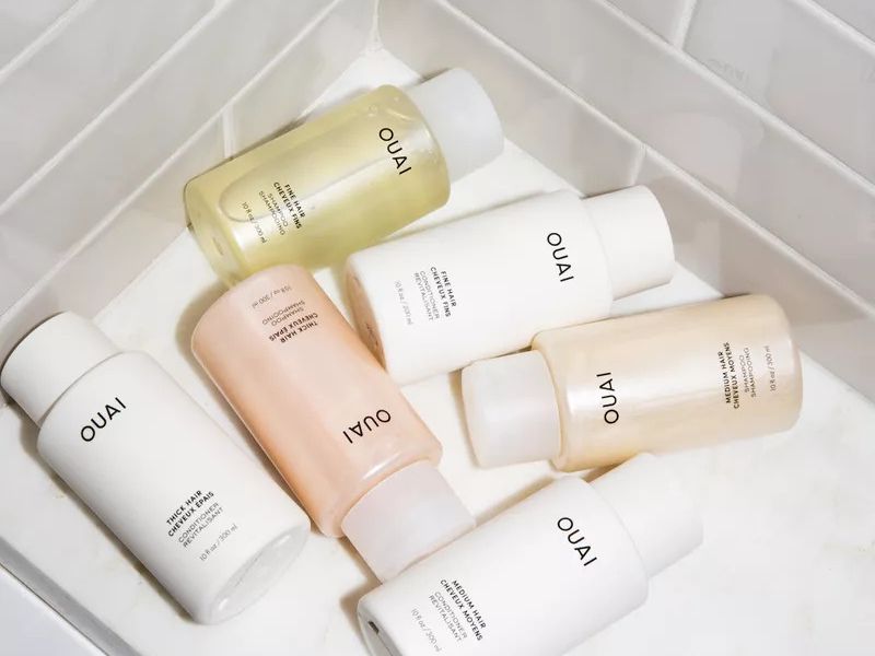
Packaging Pick: OUIA
I look for simplicity in packaging, especially for my home and bathroom. For me, I love to have a clean, minimal designs which I can showcase around the house. It makes for a very calm and clean feel to the room and Ouia does this really well. The brand itself is neutral-toned and allows the actual product to shine with their simple, luxe, and minimal packaging.
They are moving towards a sustainable future while still keeping their designs fresh and elegant. Not only that, but their photography is beautiful, and they have ensured it is diverse and inclusive. Also, but their website is lush to use!

 Slide
Slide

